
Design Reform Part III: The Aesthetic Path
It was about beauty for its own sake — the sensual pleasure of it – along with cultivating taste, refinement, and an unapologetic air of snobbery.
If the Moral Path looked to honesty and idealism, and the Pragmatic Path focused on market share and education, the Aesthetic Path rejected both. For this group, design was not, should not, be about morality or the economy. It was about beauty for its own sake — the sensual pleasure of it – along with cultivating taste, refinement, and an unapologetic air of snobbery.
The original Aesthetes were an elite, international group of avant-garde painters, architects, writers, poets, and musicians. To the painters and architects among them, the Reform mandate to combine the fine and decorative arts clearly meant that they were the ones most qualified to reform design. But beyond the concept that the fine and decorative arts were of equal value, the Aesthetes believed that all the arts were of similar value, so can and should be sources of inspiration. The American expat painter, decorator, and enfant terrible of the Aesthetic Movement, James Abbottt McNeill Whistler (1834–1903), titled his paintings ‘Nocturnes’ and ‘Symphonies’ to argue that art, like music, could be appreciated for its abstract qualities alone -- form, harmony, and emotion.
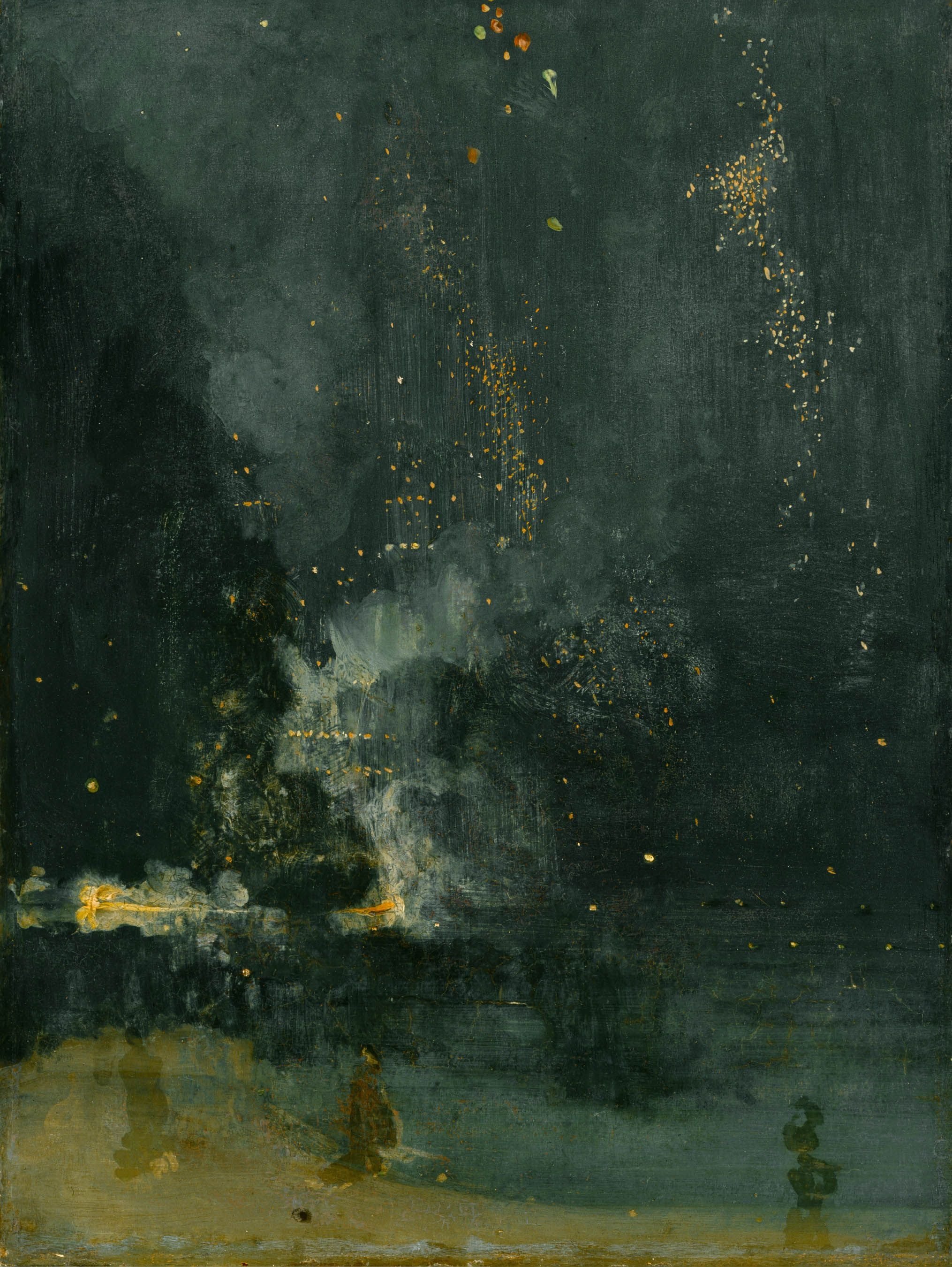
Nocturn in Black and Gold: The Falling Rocket. James Abbott McNeill Whistler. 1875. Public Domain. Courtesy of the Detroit Institute of Arts
The Value of Art and Design
In doing so, Whistler put himself on a collision course with the eminent Oxford art historian, John Ruskin. When Ruskin accused him of ‘flinging a pot of paint in the public’s face,’ Whistler sued him for libel. Technically, Whistler won but was awarded only a farthing. The real victory was his establishment of an extremely important concept in the history of all the arts, one taken for granted today and that echoed Dresser’s position on the dollar value of design.
In the most significant exchange of the trail, after hearing that it took Whistler two days to paint Nocturn in Black and Gold, the judge asked him: “For the work of two days you ask the sum of 200 guineas (+/-$4500 today)?” To which Whistler responded, “No, I ask it for the experience of a lifetime.” A new way of thinking about and seeing art was born.
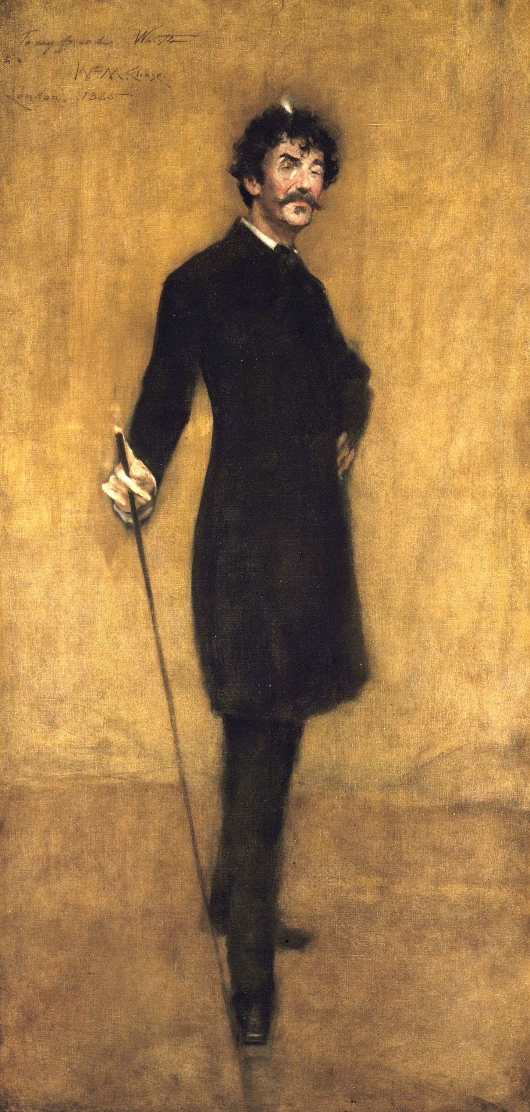
James Abbott McNeill Whistler. By William Merritt Chase. 1885. Public Domain. Courtesy of the Metropolitan Museum of Art. Accession no: 18.22.2
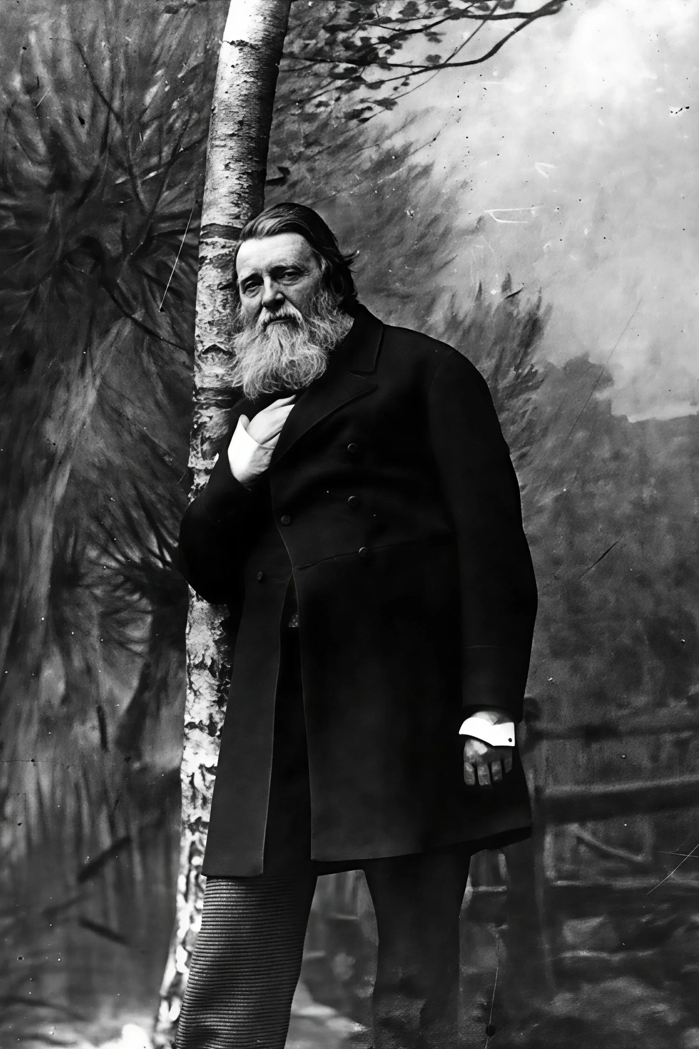
John Ruskin. 1885. By Herbert Rose Barraud (1845-1896). Public domain, via Wikimedia Commons
Japonisme and New Ways of Seeing
Arriving just as reformers were seeking non-Western and non-Classical sources of inspiration, the effect was profound.
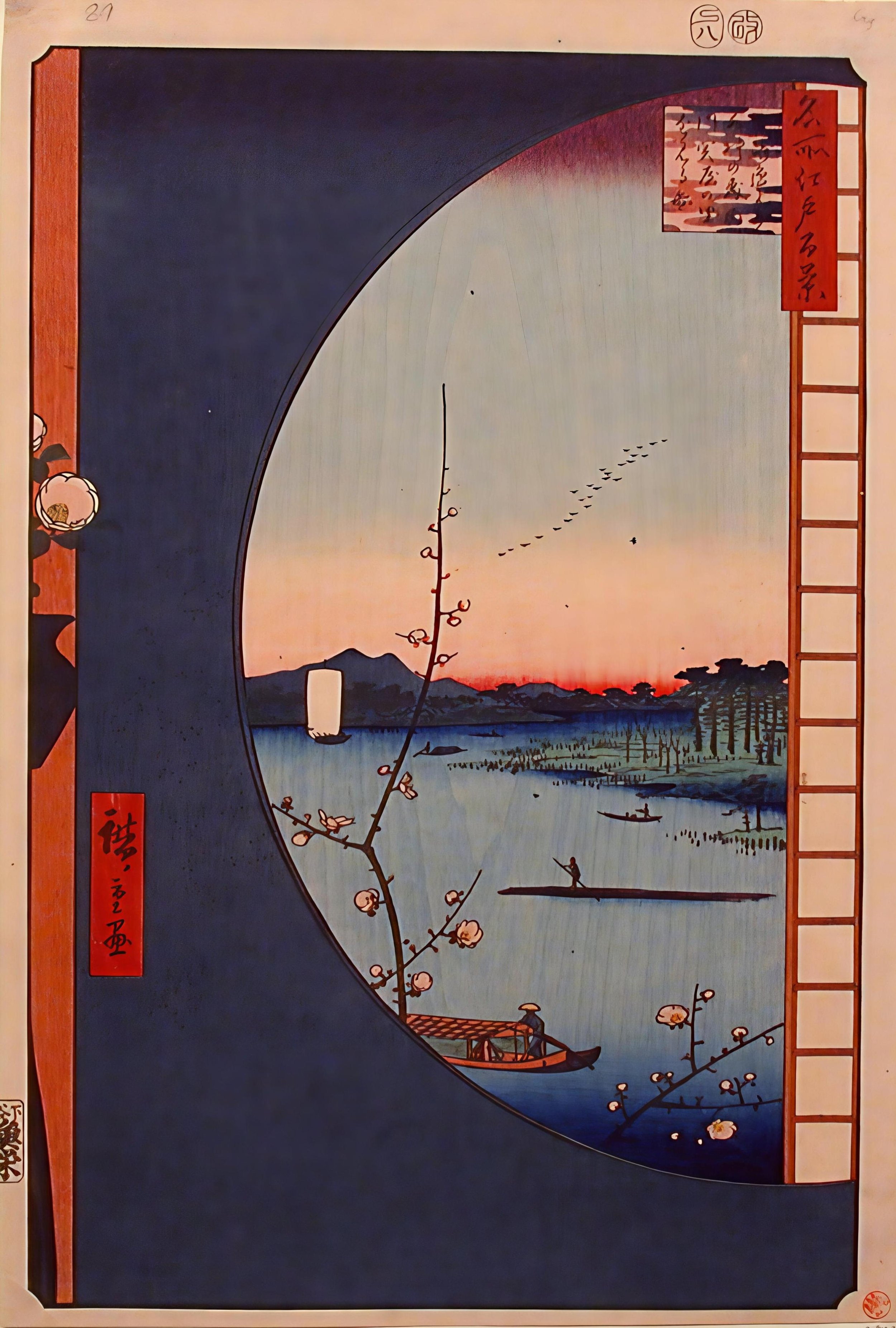
At the same time, another event was reshaping Victorian eyes. The opening of Japan to Western trade in the 1850s flooded Europe with woodblock prints, textiles, ceramics, lacquer work, and fans. Flat planes of color and pattern, slender elegant lines, stark asymmetry, abstracted imagery, and empty space -- it was everything Western art, tied to perspective and realism, was not. Arriving just as reformers were seeking non-Western and non-Classical sources of inspiration, the effect was profound. It touched them all, but Japonisme, as the phenomenon came to be known, was and remains most closely associated with the Aesthetic Movement; not only for its air of mystery and exoticism, qualities the Aesthetes delighted in, but also for its kinship with the Japanese reverence for life’s fleeting pleasures, embodied in the ukiyo-e woodblock prints.
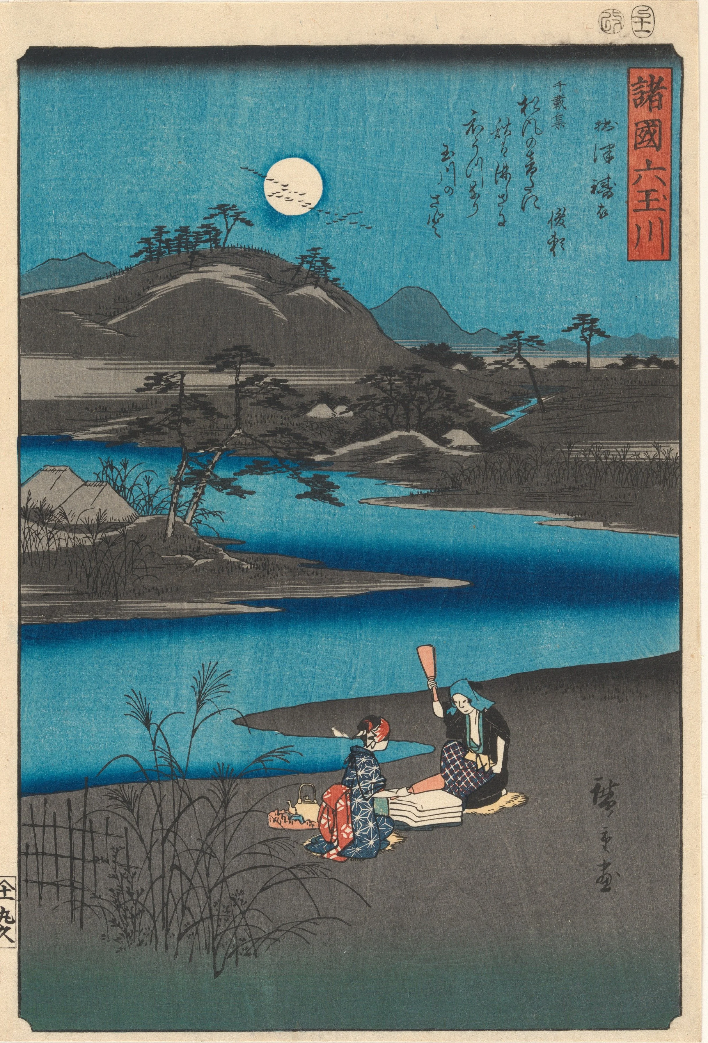
Six Jewels River from Various Provinces. Utagawa Hiroshige. 1857. Japanese Woodblock print. Public Domain. Courtesy of the Metropolitan Museum of Art. Accession no: 2015.300.227a-f
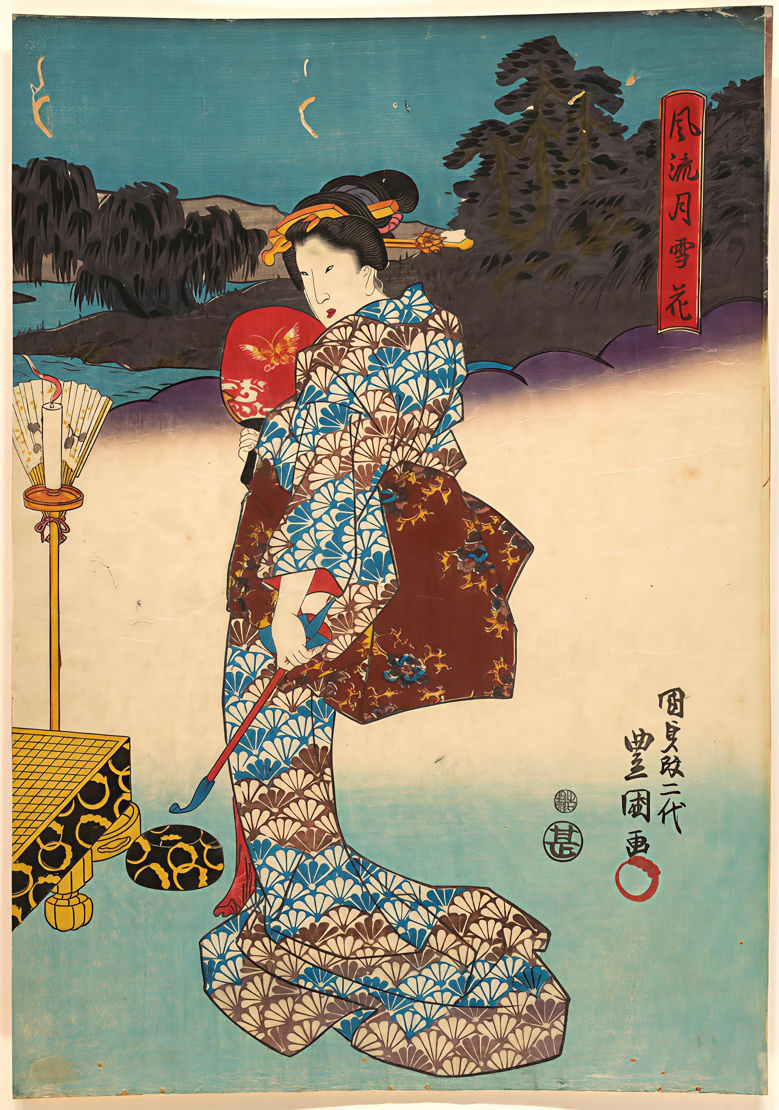
Figure of a Woman. Utagawa Kunisada. Japanese woodblock print. Edo Period (1615 – 1868). Public Domain. Courtesy of the Metropolitan Museum of Art. Accession no: JP1092.14
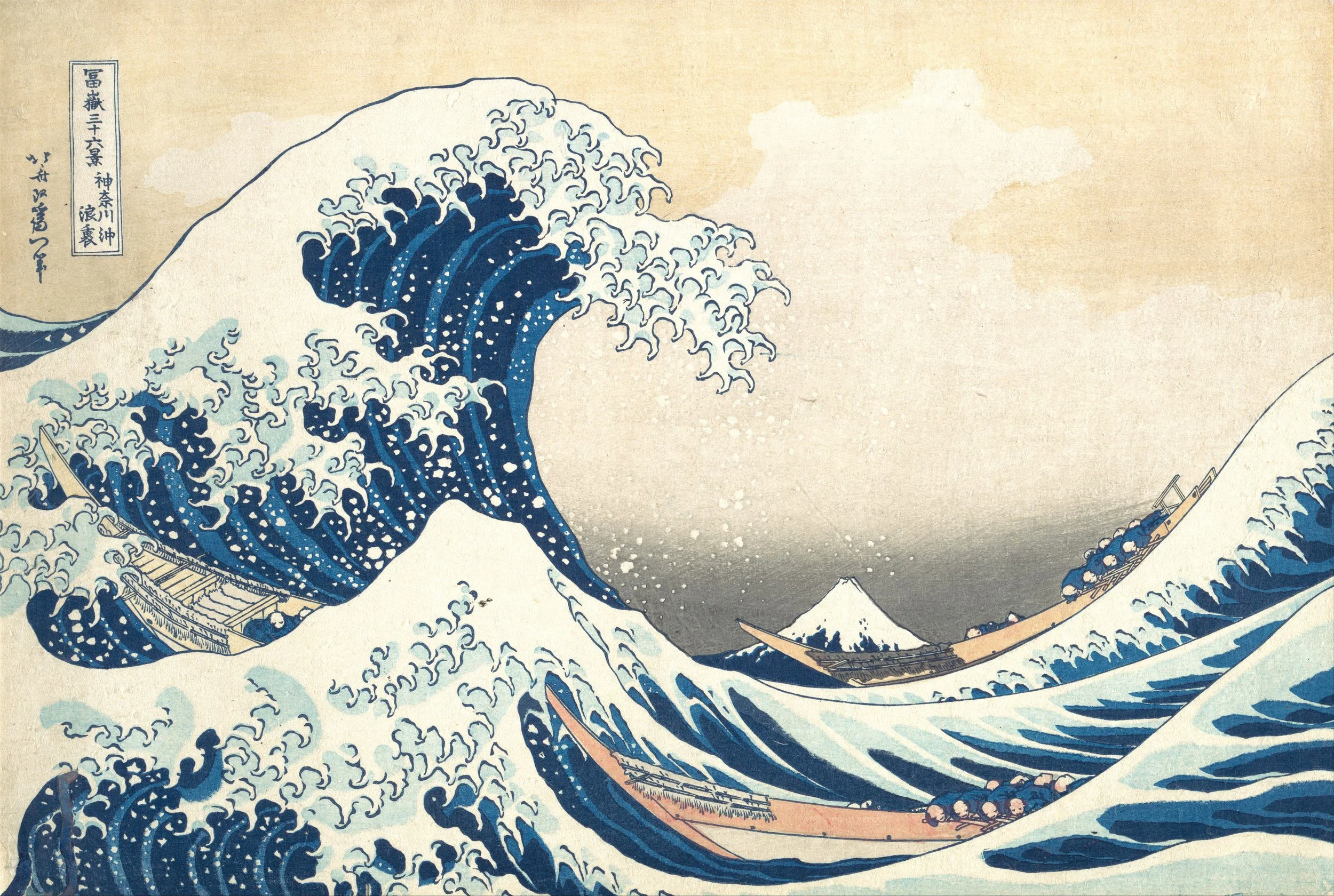
The Great Wave. Katsushika Hokusai. 1830–32. Public Domain. Courtesy of the Metropolitan Museum of Art. Accession no: JP2569
Aesthetic Design I: The Peacock Room
For the Aesthetes, reforming design embodied the idea that an interior could be a “total work of art”-- a cohesive, unified, artistic composition, designed first and foremost to express beauty.
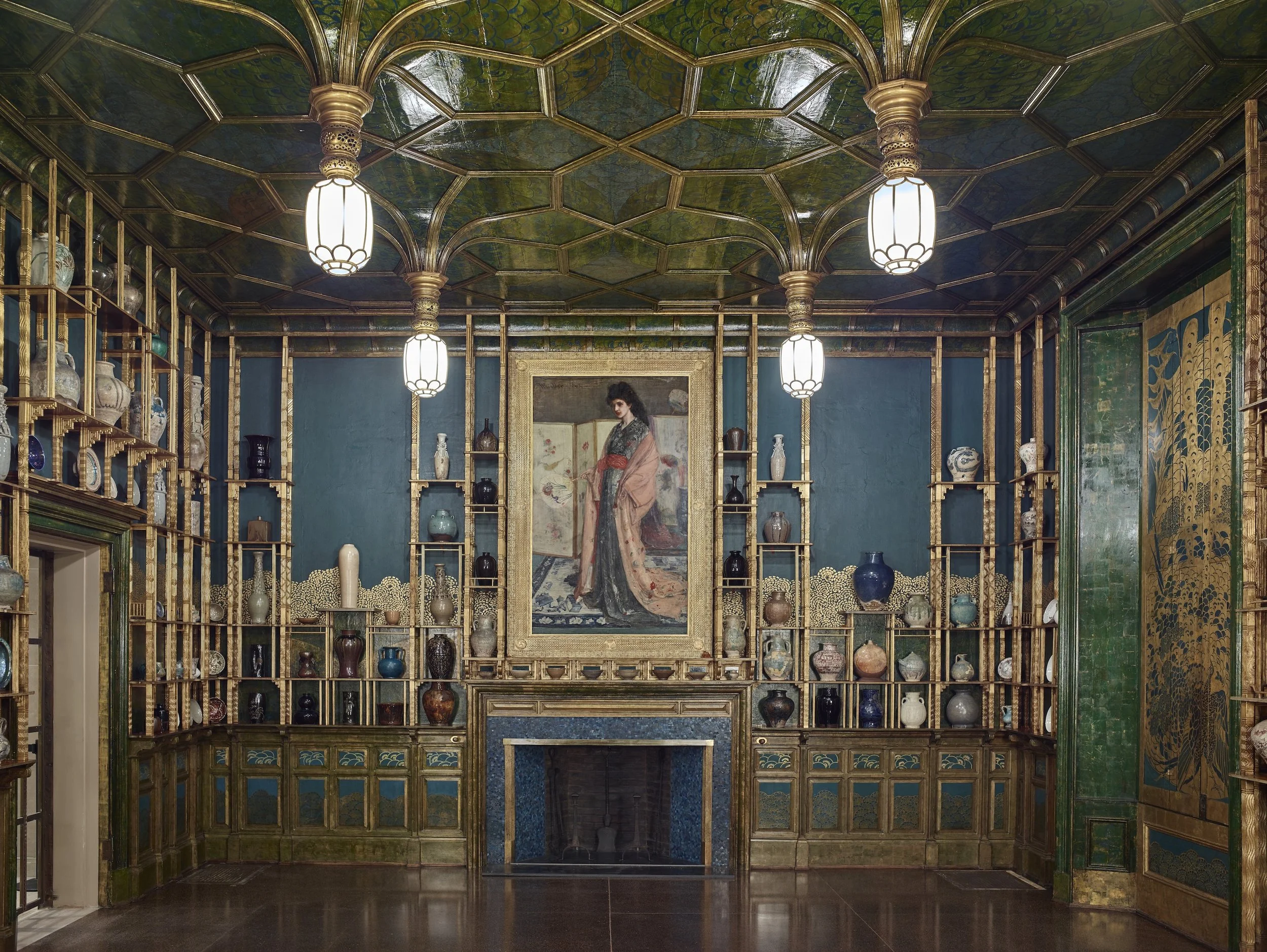
Harmony in Blue and Gold: The Peacock Room. James Abbott McNeill Whister. 1887. Featuring the Princess in the Land of Porcelain. James Abbott McNeill Whistler. c. 1864. Translocated to the Freer Gallery of Art, Washington, D.C. Freer Gallery of Art and Arthur M Sackler Gallery. Accession no: F1904.61. Public Domain via CC0 1.0 https://creativecommons.org/licenses/by-sa/2.0, via Wikimedia Commons
There is perhaps no better example of the mix of mystery and exoticism, the fine arts and the decorative arts, than Whistler’s most infamous interior: the Peacock Room (1876–77). Created for shipping magnate Frederick Leyland’s London house and meant to impress, it was a gallery for his collection of oriental ceramics and other works of art. Walls of green lacquer with gold leaf peacocks; a gilt, Gothic, fan-vaulted ceiling; ceramics integrated with the architecture; all presided over by Whistler’s Princess in the Land of Porcelain. Dazzling and theatrical, it is remembered as notorious today for the way Whistler commandeered the project, transforming it from a more traditional room to one that some – including the owner – considered shocking. But for the Aesthetes it embodied the idea that an interior could be a “total work of art”-- a cohesive, unified, artistic composition, designed first and foremost to express beauty. The seamless integration of the ceramics, lighting, furnishings, and central painting into the fabric of the room reflects the unified interior aligned with the goals of Design Reform—and what later scholars would describe as a Gesamtkunstwerk.
Gesamtkunstwerk — The “Total Work of Art”
The term Gesamtkunstwerk—German for “total work of art”—was coined by composer Richard Wagner in the mid-nineteenth century to describe his vision for a unified theatrical experience. In Wagner’s operas, music, poetry, staging, architecture, costume, gesture, and lighting were conceived as interdependent components of a single dramatic expression. No element was decorative or secondary; each served the emotional and narrative whole.
Interior designers of the period pursued a surprisingly similar ambition. A well-designed room brought together architecture, furnishings, color, textiles, ornament, ceramics, metalwork, paintings, and lighting into one coherent visual and spatial composition. As in Wagner’s theater, every element contributes to the overall effect, and removing any part would weaken the intention of the design.
Although Wagner’s theory arose from the world of music and drama, its underlying principle — the unity and equality of all the arts — resonated strongly with nineteenth-century design reformers; the Aesthetic Movement, especially, treated the decorative arts with the same seriousness and expressive potential as painting or sculpture. Designers created immersive interiors in which each component was deliberately orchestrated to support a larger artistic vision. The Peacock Room is an excellent example.
It is important to note, however, that nineteenth-century designers did not use the term “Gesamtkunstwerk.” The word was not circulating in design circles at the time; it was applied later by historians to describe interiors and buildings that pursue this kind of total artistic unity. Still, the idea of a “total work of art” — a harmony of many elements working as one — was very much in the air, shaping the ambitions of Design Reform, intensifying in the Aesthetic Movement, and eventually finding full expression in Art Nouveau.
Aesthetic Design II: Anglo -Japanese
"I look upon all my work as artwork. A building is to me as a picture to a painter or a poem to a poet."
E.W. Godwin
If the Peacock Room represents the Aesthetes’ fascination with the rich, the sensual, and the exotic, the movement had an equally compelling counterpoint in the work of Edward William Godwin (1833–1886). Known as E. W. Godwin, he drew upon the simplicity, refined linearity, and reverence for tradition inherent in Japanese design. That conviction shaped both his Anglo-Japanese furniture and his interiors, where clarity of line and disciplined composition replaced the opulence embraced by his contemporaries.
Since a picture is worth a thousand words, consider how the following group of images (and the foregoing Japanese prints) illustrates the elegant line and two-dimensional, asymmetrical, graphic quality of Japanese prints as expressed by artists like van Gogh and Godwin.
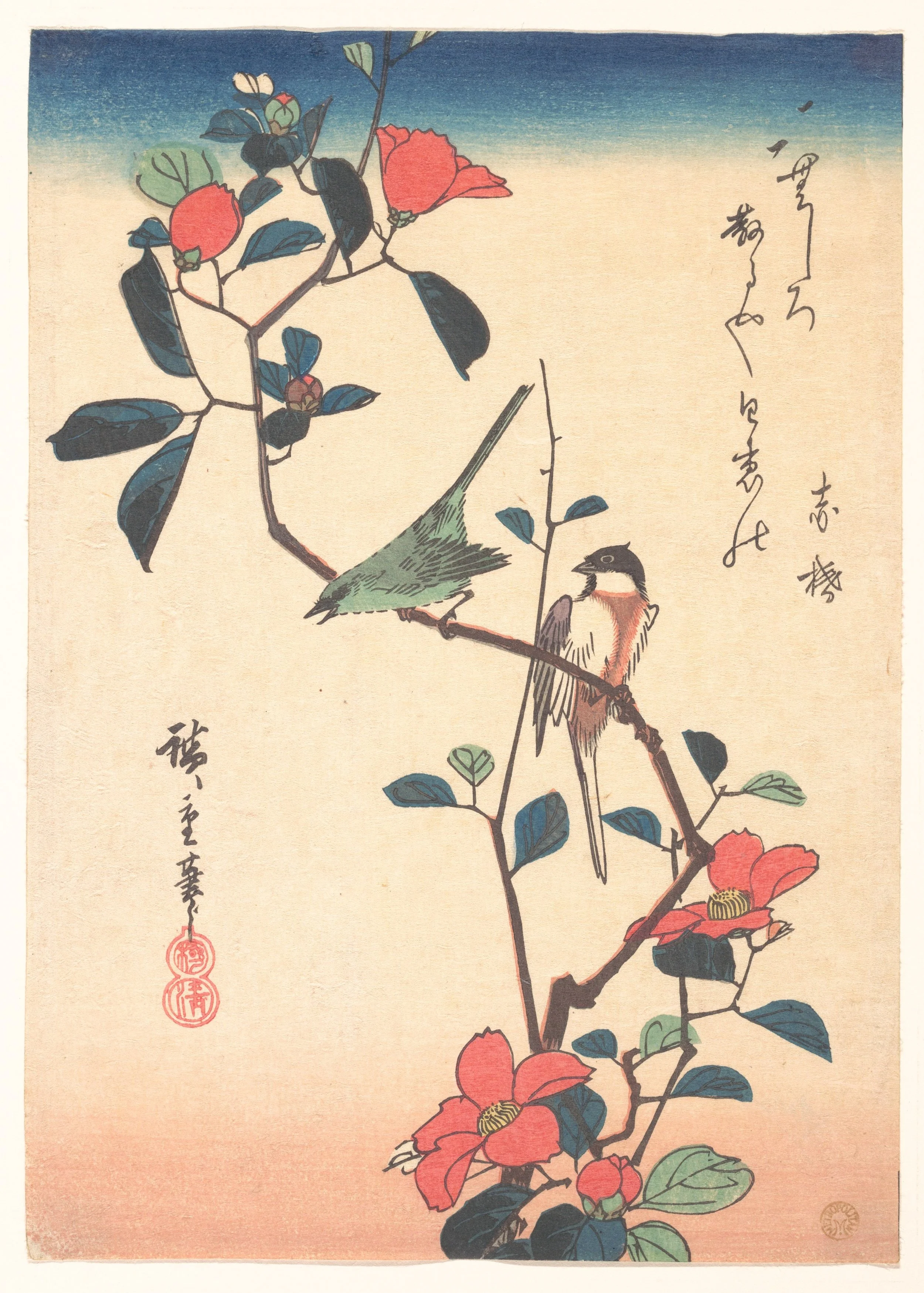
White-eye and Titmouse on a Camellia Branch. Utagawa Hiroshige. c. 1840. Japanese woodblock print. Public Domain. Courtesy of the Metropolitan Museum of Art. Object no: JP250
Small View of Yedo. Utagawa Hiroshige. 1817-58. Public Domain. Courtesy of the Metropolitan Museum of Art. Object no: 1975.1.982
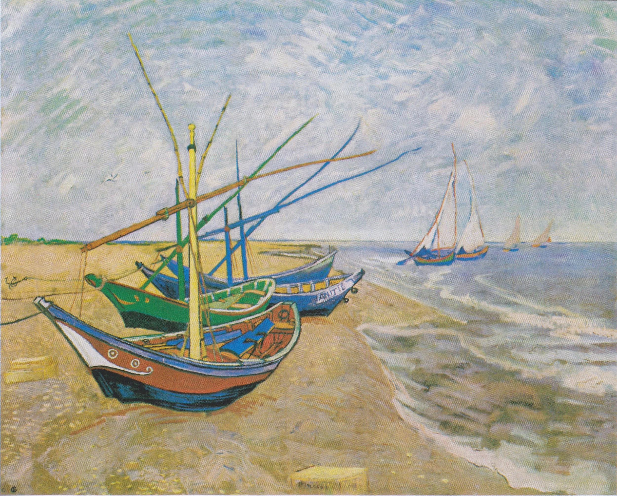
Fishing Boats on the Beach at Saintes-Maries. Vincent van Gogh. 1888. Public Domain F413 via Wiki Commons, courtesy of the Vincent van Gogh Museum. van Gogh was an early and great fan of Japanese prints, apparent here in the palette and the quality of line.
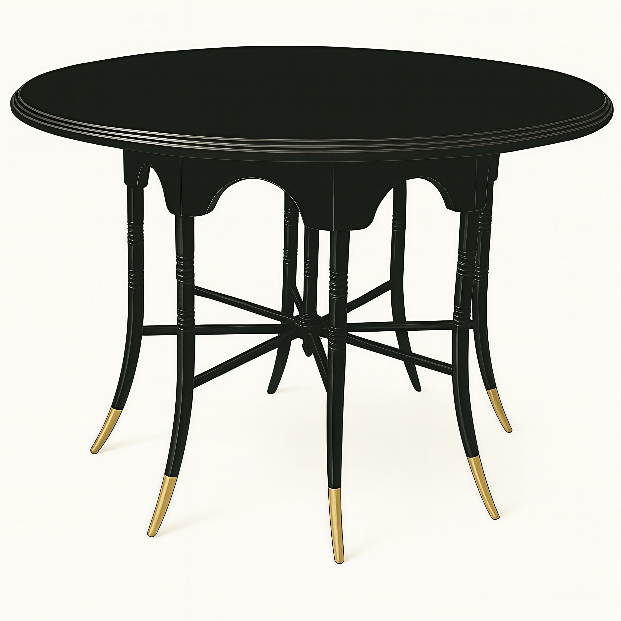
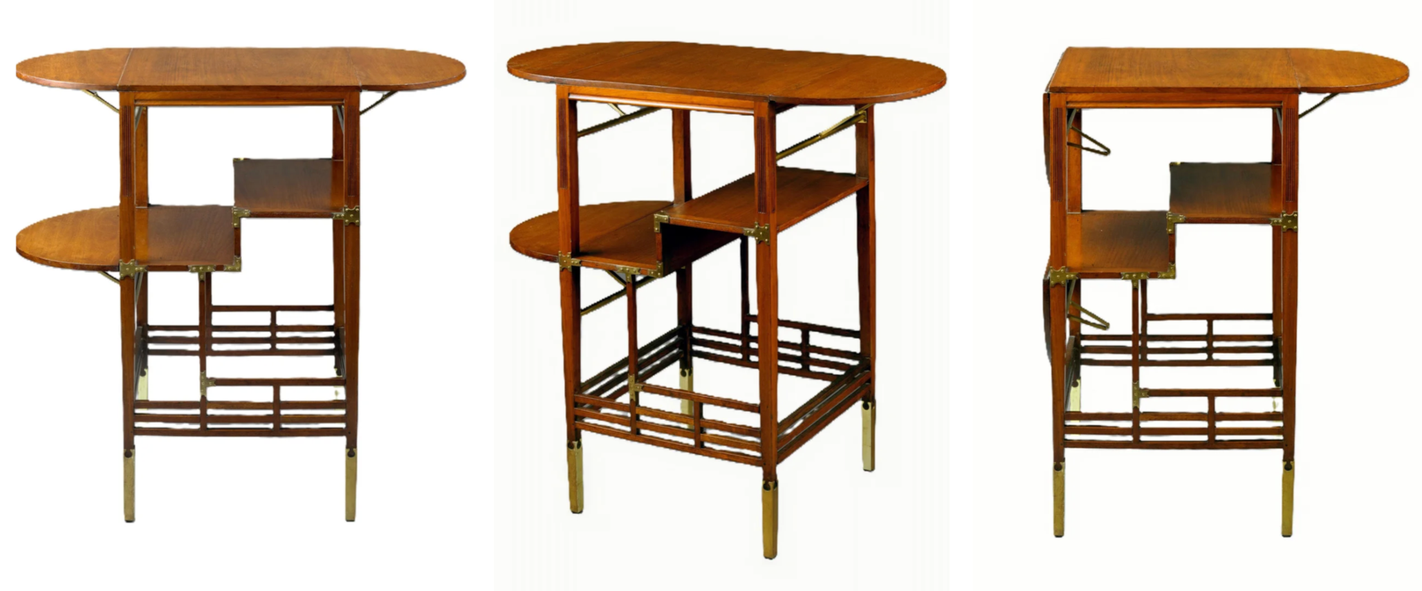
Circular table in ebonize wood with eight legs and brass feet. Edward William Godwin. 18876 -85. Possibly manufactured by the firm of Willliam Watt or Collins and Lock, London. Victoria and Albert Museum W.54—1980. The Victoria and Albert Museum. Public Domain via CC01-0 Universal. Wikipedia Commons. (The background and color of the image have been enhanced from the original for editorial purposes)
Note the slender lines, gentle movement of the legs, and the Japanese pinwheel stretcher. Over millennia of building in wood to protect against the devastation of earthquakes, Japanese joinery became a sophisticated art form.
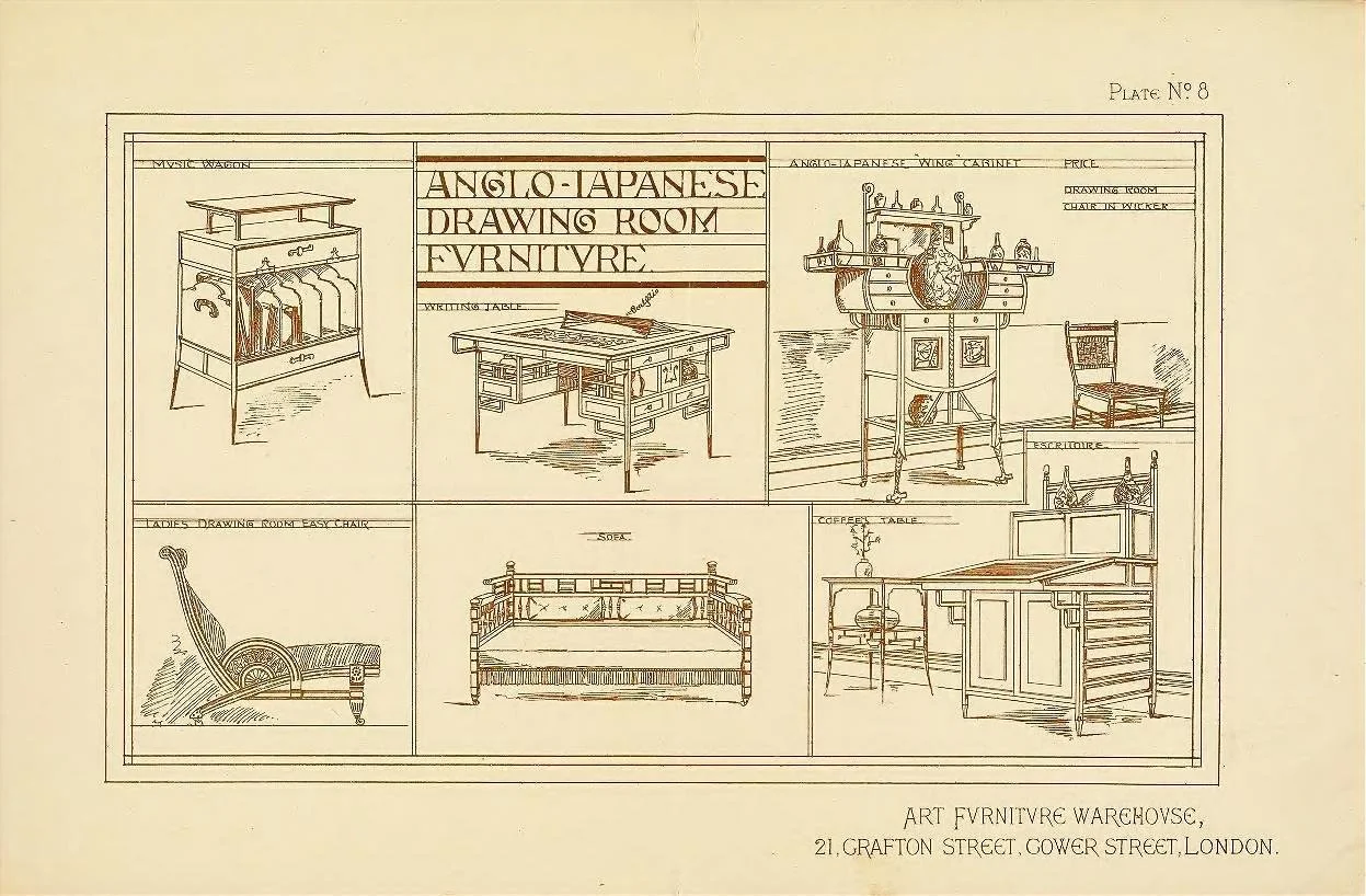
Anglo-Japanese furniture designs by Edward William Godwin. 1877. William Watt. Public Domain via Wikimedia Commons.
Below are two pieces rendered in AI to give a better idea of what they actually looked like.
Rendered Furniture
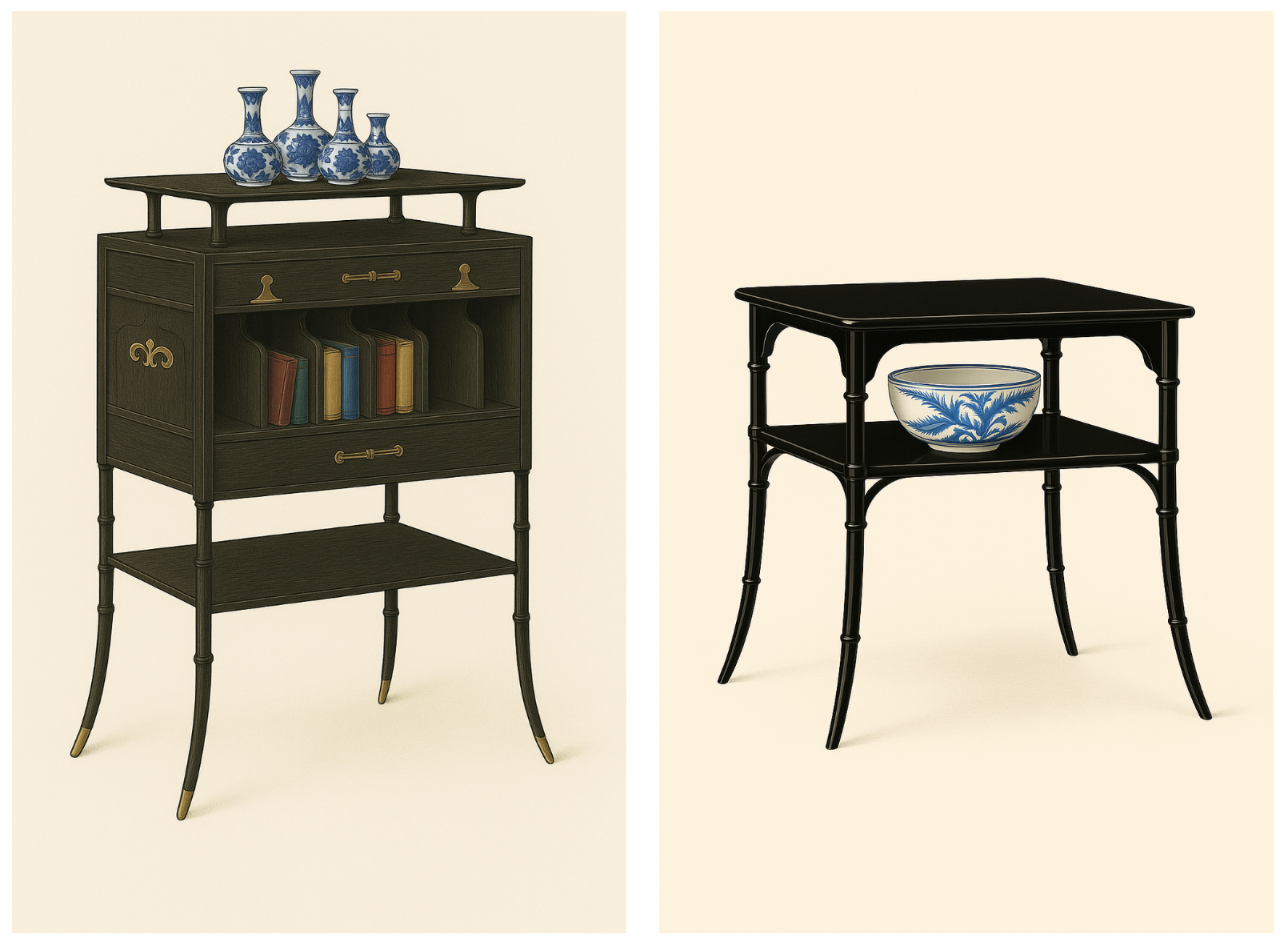
Two pieces from the William Watt advertisement, rendered in AI, to show color and details. Most, but not all, pieces were ebonized – painted black to imitate Japanese lacquer. The elegantly curved legs are notched to imitate bamboo. The hardware was often a unique design by Godwin, drawn from a variety of cultural/ historical sources.
E.W.Godwin
Although E.W. Godwin described his work as “Anglo-Japanese,” the source of that influence was not actual Japanese furniture but the visual language of Japanese prints that swept through Europe in the 1860s and ’70s. For Western artists, Japan suggested refinement through line rather than mass—the idea that form could be defined by contour instead of modeled by volume. Godwin’s furniture often reads like a drawing in space: slender uprights, lattice planes, and stretchers that intersect like ink lines on paper. His subtle curves evoke the sinuous calligraphic sweep of a brushstroke more than any historical Japanese furniture prototype. In this sense, Godwin performed an act of visual translation between the pictorial and the spatial—turning the two-dimensional elegance of ukiyo-e into the three-dimensional poetry of structure. (See list of sources at the end of this article)
In addition to the lyrical, asymmetrical lines of Japanese prints, Godwin, an architect as well as a designer, was naturally drawn to the structural clarity of Japanese architecture, with its emphasis on horizontal and vertical lines. The Imperial Villa of Katsura is a prime example of this linear refinement. As in many cultures throughout history, architectural principles often find their way into furniture design, and in Godwin’s case, such translation would have been second nature.
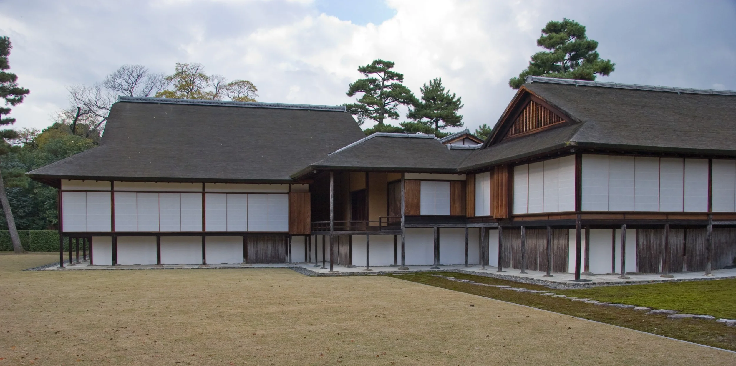
The Imperial Villa of Katsura. Near Kyoto, Japan. c.first half of the 17th century. Lines are as elegant as those in prints, but with an emphasis on horizontal and vertical. Public Domain via Wikimedia Commons. Kimon Berlin https://www.flickr.com/photos/kimon/3264799678/. https://creativecommons.org/licenses/by-sa/2.0/deed.en
While Katsura was unknown in the West during Godwin’s lifetime, he was familiar with Japanese building techniques.
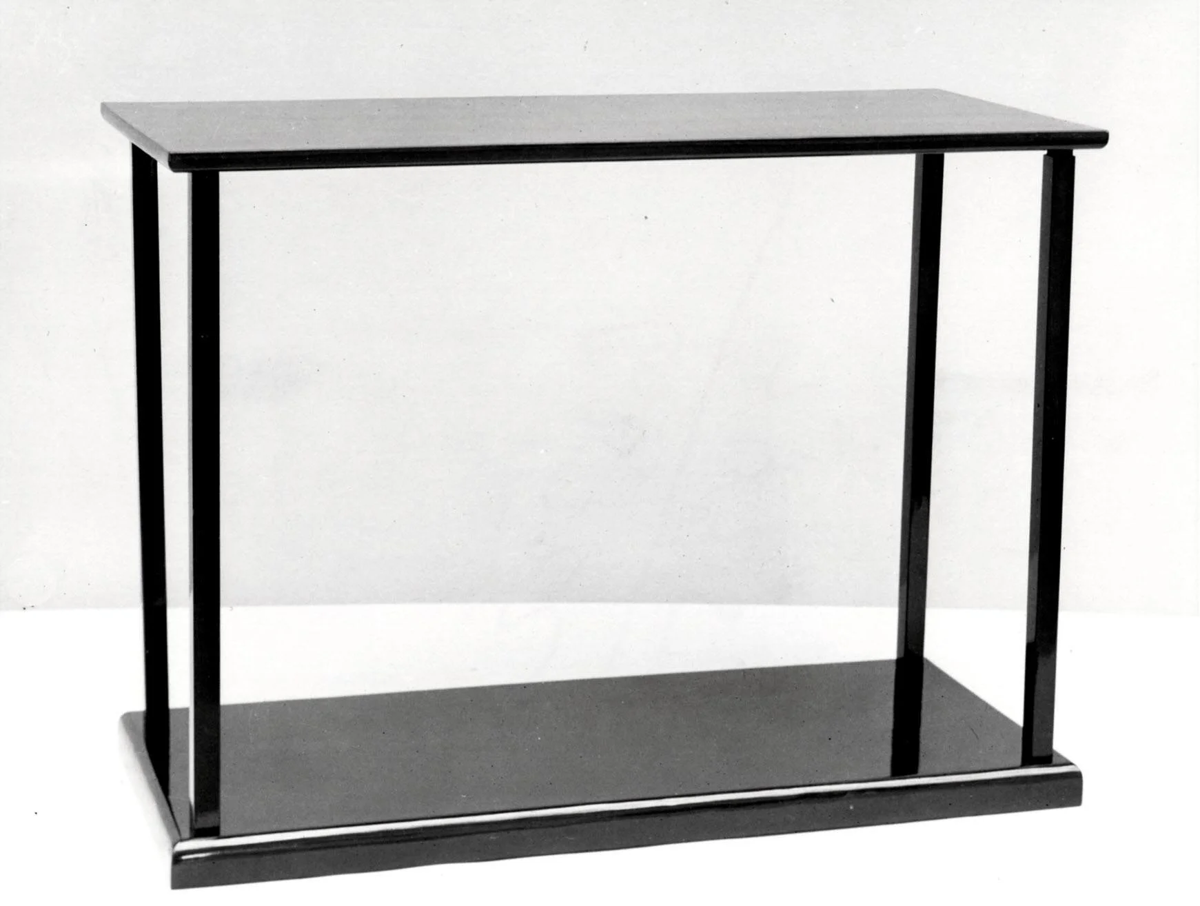
Table for a tea ceremony. Japan. 18th century. Black lacquer Public Domain. Metropolitan Museum of Art. Accession no: : 25.215.54a–f.
Godwin would certainly have seen furniture like this exhibited by the Japanese in London(1862) and Paris (1867), which exemplifies the Japanese architectural emphasis on horizontal and vertical, as well as slender line.
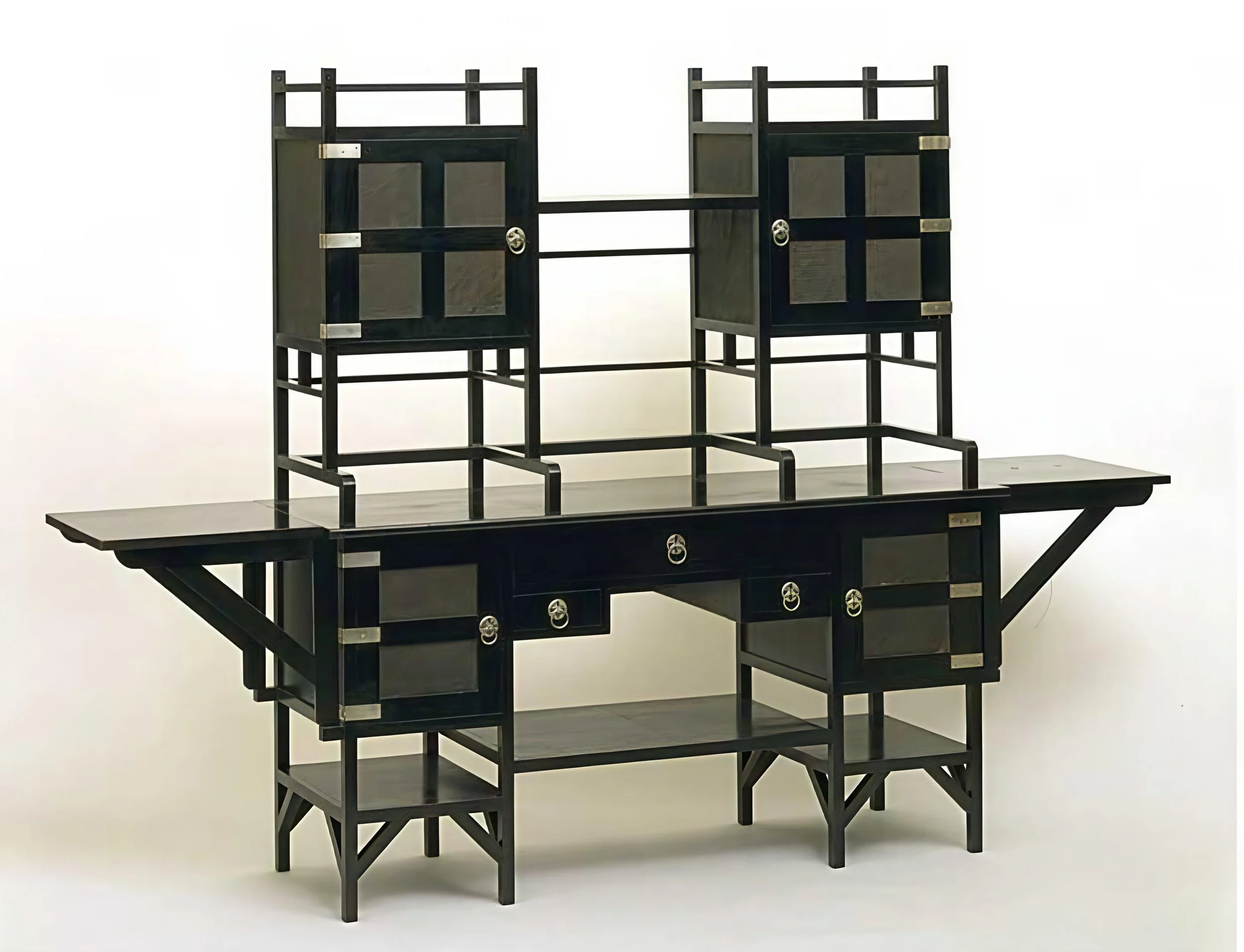
Sideboard. Edward William Godwin. 1867-80. Mahogany, ebonized, with silver-plated handles and inset panels of embossed leather paper. Victoria & Albert Museum no. CIRC.38:1 to 5-1953. The original uploader was VAwebteam at English Wikipedia. Public Domain. CC BY-SA 3.0 http://creativecommons.org/licenses/by-sa/3.0/, via Wikimedia Commons
Reshaping Tradition
Drawing on Japanese furniture traditions, Godwin created something new — perfectly suited to the Aesthetes’ belief in creative freedom. That said, another important lesson learned from the Japanese was their embrace of tradition. They didn’t throw their past away but retained it as a meaningful part of their identity.
Considering this, Reformers who had shunned the past in reaction to “revivals” felt free to look with a new attitude at styles that had been abandoned as “Western” and old-fashioned. Giants of their own design heritage, such as Thomas Sheraton and George Heppelwhite, were given a second look, and their slender Neoclassical lines were seen as similar to those of Japanese design. Moreover, there was already a connection between Asia and certain eighteenth-century English furniture styles, which were greatly influenced by the influx of Chinese designs at that time. Godwin’s appreciation of this is expressed in his adaption of the traditional English Pembroke table.
Side Table. Edward William Gowin. 1872. Walnut and gilt brass. Public Domain. Courtesy of the Metropolitan Museum of Art. Object no. 1991.87.
The multi-functional side table with two drop leaves, commonly known as a Pembroke table, was a staple in most English households. The natural wood tone of Godwin’s version, instead of black, enhanced the message of “traditional English table.” Powerful counterpoints to this are the slender Japanese line and asymmetry, while the fretwork references both East and West. A frequent element of eighteenth-century English furniture, it was the result of Chinese influence.
The Popularization of the Aesthetic Movement
The aesthetic of the original Aesthetes soon trickled down to the average person seeking good design. An attractive principle of Aesthetic style was that it encouraged personal artistic expression. Many liked the idea of combining the old, new, and exotic with what, today, we might call “flea-market finds” and items of personal significance on their own into an artistic environment -- often with a casual, “I-just-threw-it-together” air. Moreover, many viewed the Arts and Crafts style as too rigid in form and too political or religious in the messages it communicated.
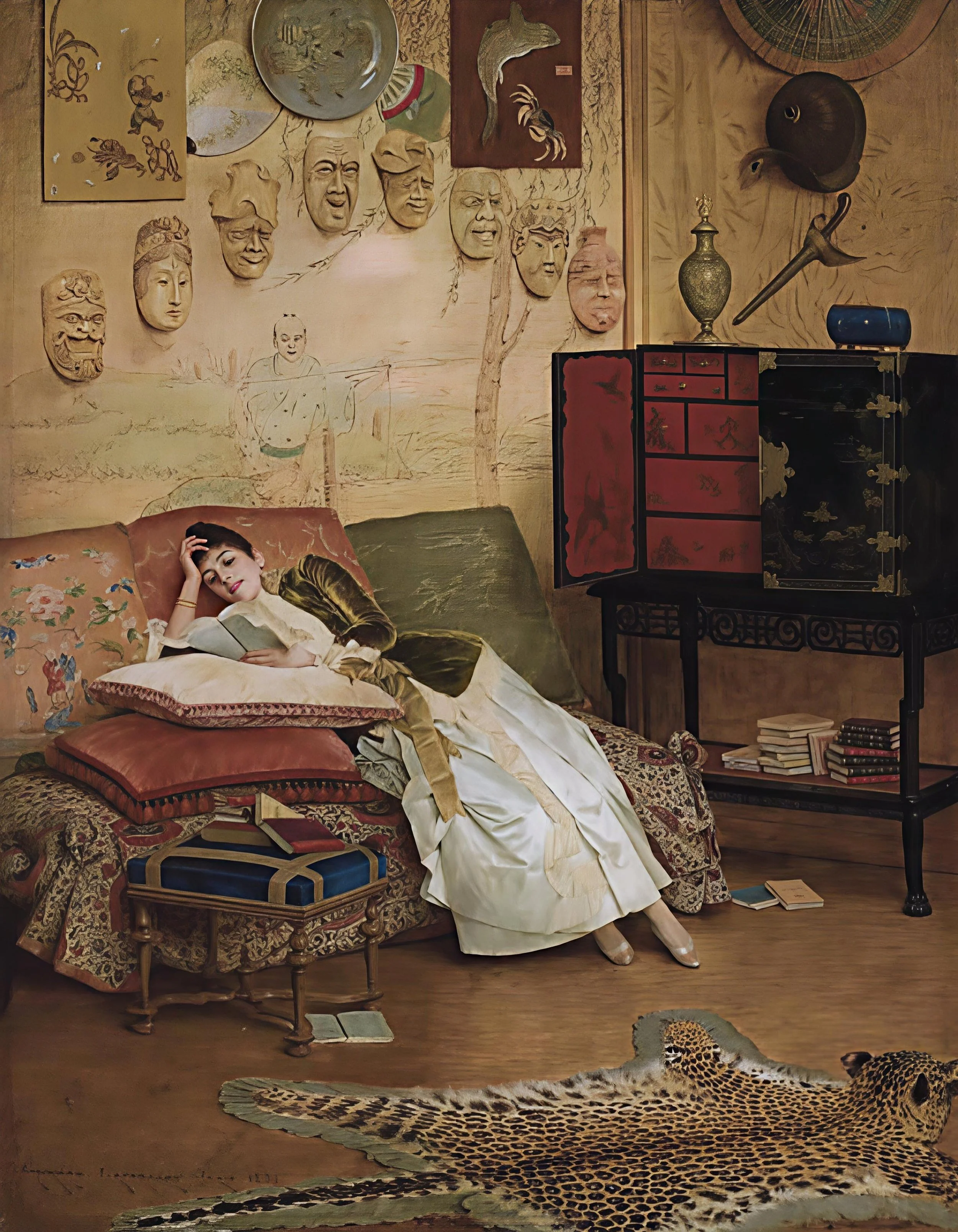
Liseuse. Georges Croegaert. 1888. Public Domain via Wiki Commons.
Many people were attracted to the impromptu, improvised, somewhat exotic, personal, artistic expression of Aesthetic style
The Composed Interior
The complexity of the time is reflected in complex design and a taste for it.
Perhaps the most significant result of reuniting the fine and decorative arts, as stressed by all reformers, was the effect it had on the typical Victorian interior. Why was it so painfully overwrought? Answer: style is a product of the context.
The nineteenth century was a complex and often contradictory era, as explored throughout this series (see Intro to Design Reform and Design Reform Parts I and II ). Much of that complexity stemmed from the profound social changes brought about by the Industrial Revolution. For the first time, two new populations emerged on a large scale: a rapidly expanding middle class with unprecedented levels of disposable income, and, in stark contrast, an equally vast labor force living and working in severe hardship—whose exploitation made that new prosperity possible.
For the newly affluent, the explosion of consumer goods was both exhilarating and overwhelming. They longed to display their new status, but inexperience and doubt about matters of style, taste, and aesthetics produced genuine social anxiety. Layered onto this was the emotional tension of the age itself: a culture eager to step into an exciting industrial future, yet nostalgic for what now seemed like a simpler, more comprehensible past.
The complexity of the time is reflected in complex design and a taste for it. In the belief that the more complex a thing appeared – that is, the more time and material heaped upon it -- the more valuable/ desirable it was. A mindset confronted by both Dresser and Whistler.
The image below illustrates this complexity in a typical Victorian interior: Too much stuff “forced” into a space, not “designed” into it; overlaid with a chaotic mix of textures and patterns. Before the machine, textiles signaled wealth, so the newly affluent made lavish use of them. But mass-produced upholstery and heavy drapery only darkened the space.
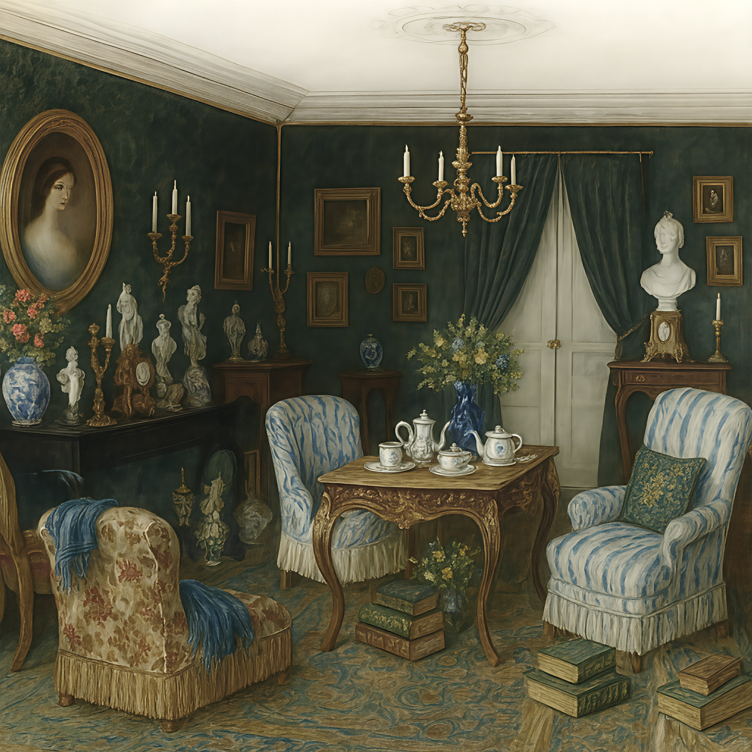
The image at left illustrates this complexity in a typical Victorian interior: Too much stuff “forced” into a space, not “designed” into it; overlaid with a chaotic mix of textures and patterns. Before the machine, textiles signaled wealth, so the newly affluent made lavish use of them. But mass-produced upholstery and heavy drapery only darkened the space.
An illustration of what a typical, middle-class, Victorian interior often looked like. AI-generated @Teresa Ryan, 2025
And the Reformers were not exempt from this. They were part of this culture. There was no escaping it. Much Reform design is complex -- but with a big difference: It is composed complexity. One of the best examples of this is this interior by Bruce Talbert. While at first glance it appears quite “busy,” it arose from a cross-current of Reform influences. Step back and look again. It is anchored by Reform practices that endow it with an air of order, ease, and even freshness. Key words: graphic clarity, layered surfaces, and deliberate compartmentalization.
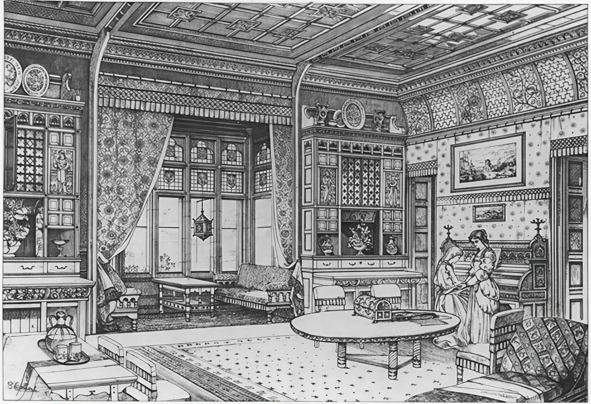
A Study of Decorations and Furniture. Bruce James Talbert. Illustration published in The Architect (magazine), July 24, 1869. (PDM1.0)
There are many layers of pattern, materials, textures, colors (surely), and stylistic references creating the sensual richness favored by the Aesthetes, but it is not a jumble of historical revival styles. All is sensitively and artistically composed. HOW is that? What makes this complex interior different than the one before it?
The patterns are FLAT. Stylized and/or geometric. They are appropriate to the surface they adorn and do not overwhelm the space with their presence. This “honesty” was favored by the Moralists and Pragmatists, but many Aesthetes admired it mostly for the connection to Japanese prints….
….a quality enhanced by the profusion of slender horizontal and vertical lines that maintain the order of the composition through compartmentalizing the patterns and materials.
The tall cabinets appear built in, part of the architecture, so contribute to unity.
Furniture balanced with the space, in terms of quantity and proportion
Simple profiles, no outlandish 3D carving
Incised and turned ornament -- part of the structure, so more “authentic”
Clearly defined zones of activity
EMPTY SPACE between them
A reasonable amount of art and objects displayed within discreet, uncluttered spaces
Elements related to the Middle Ages, the Middle East, and the vernacular (non-Classical, non-Western) work well together thematically and stylistically.
All elements arise from a familiar form or aesthetic; however, all are contemporary interpretations, achieved through abstraction and stylization. The space is familiar and comfortable without being a jumble of revival styles.
Unobstructed windows allowing sunlight to flood the room, with stained glass adding touches of color, artistry, and mystery to the atmosphere (which any Aesthete worth his peacock feathers would love).
While this interior is Aesthetic in richness, and authorship – Bruce Talbert was a leading Aesthetic designer – parts of all three Paths of Design Reform can be detected here, intermingling, overlapping, for similar and/or different reasons. But the overall effect is a space that is a unified work of art – exactly what each group wanted to achieve.
Conclusion
Design Reform unfolded along three Paths: Moral, Pragmatic, and Aesthetic. The Moral Reformers sought honesty and idealism. The Pragmatists built institutions and rules. The Aesthetes insisted on art for art’s sake. They all called for reuniting the fine and decorative arts. Together, they framed the Victorian debate about design. And together, they laid the groundwork for the radical shifts of the twentieth century.
Click here to read Intro to Design Reform, Design Reform Part I, Design Reform Part II (or just use the arrows at bottom of page)
Click here to download a free copy of The Three Main Paths of Design Reform
Be sure to sign up below to receive guidance, visual insights, ideas, and resources to help you develop a deeper way of seeing and understanding art and design. (Coming soon!)