
The Union of Opposites: Why it creates compelling design
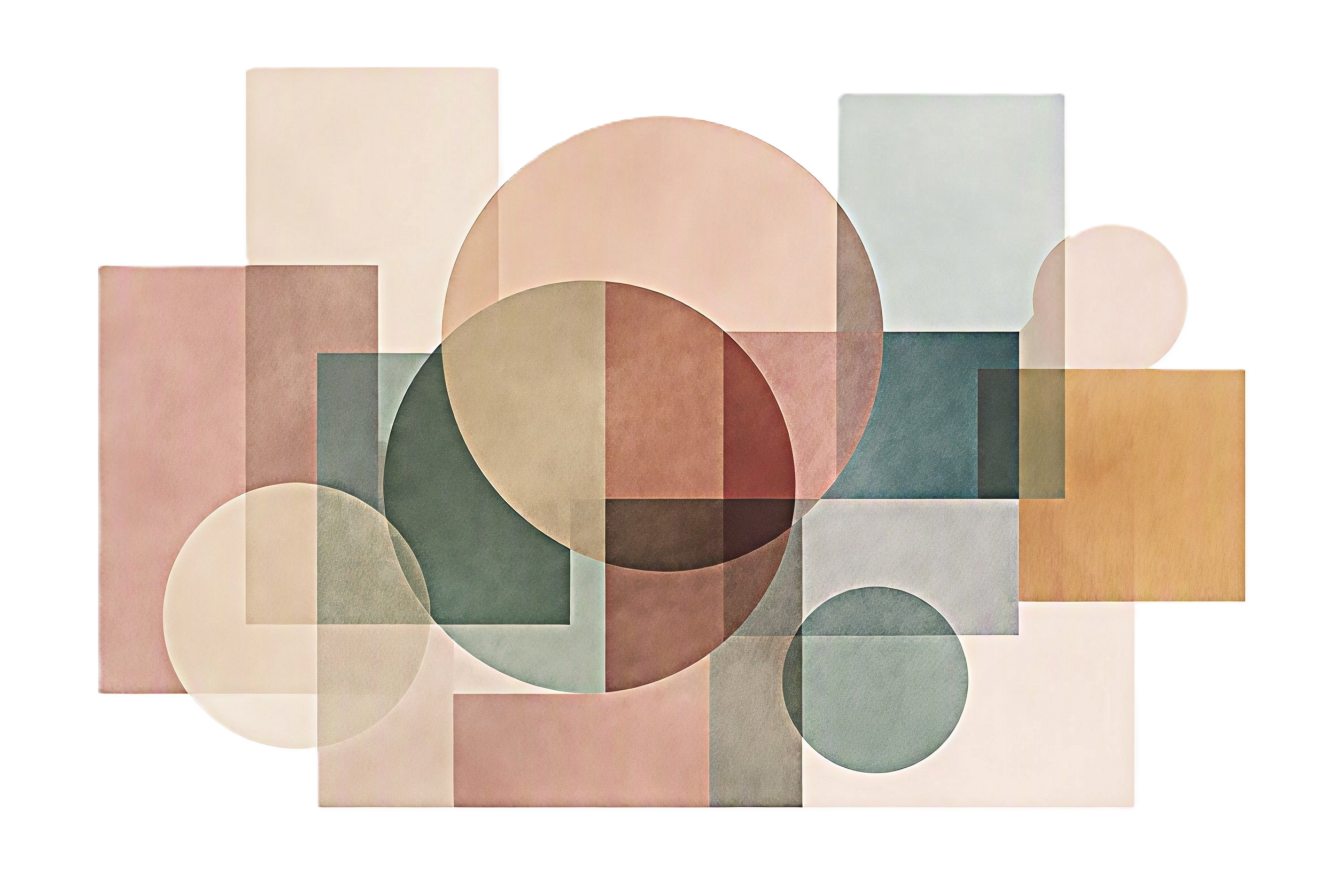
A Union of Opposites. Concept and art direction by the author. Generated with AI.
The Paradox of Compelling Design
We tend to assume that good design depends on consistency: that things should belong together, speak the same language, and reinforce one another. Often they should. But some of the most compelling design does something more difficult. It brings together qualities that seem opposed — traditional and modern, rough and refined, geometric and organic, practical and poetic — and somehow makes them belong to the same whole.
This is more than contrast. Contrast highlights difference. The union of opposites asks more: can two seemingly incompatible qualities remain distinct and still be reconciled?
In this context, reconciliation does not mean that one quality absorbs the other, or that their differences disappear. It means that two seemingly conflicting qualities are brought into a relationship that “works”— that allows them to participate in a new, satisfying whole.
And the idea reaches far beyond design. For centuries, philosophers have explored the possibility that harmony can emerge not from sameness, but from the relationship between unlike or opposing forces. What designers sometimes do instinctively when they bring contrary qualities into balance is part of a much larger principle — one tied to creativity, harmony, and the meaning of order.
The Roots of Reconciliation

The Solar System According to the Geocentric Model of Claudius Ptolemaeus. © FabioConcetta | Dreamstime.com
The union of opposites was not invented by artists and designers looking for a way to make their work more interesting. Its roots reach much further back, to ancient attempts to understand the organizing structures found in nature, the individual, society, and the cosmos.
The early Greeks were not thinking about art or design when they explored these ideas. They were asking much larger questions: What creates a balanced individual? What holds a society together? Why does music sound harmonious? Is there an underlying order to nature — to the universe?
For the Pythagoreans, one answer lay in relationship. They discovered that musical harmony could be expressed through numerical ratios and extended that idea of proportion and harmony into a much larger conception of cosmic order. The same underlying relationships that could produce harmony in music were understood as evidence of an ordered universe.
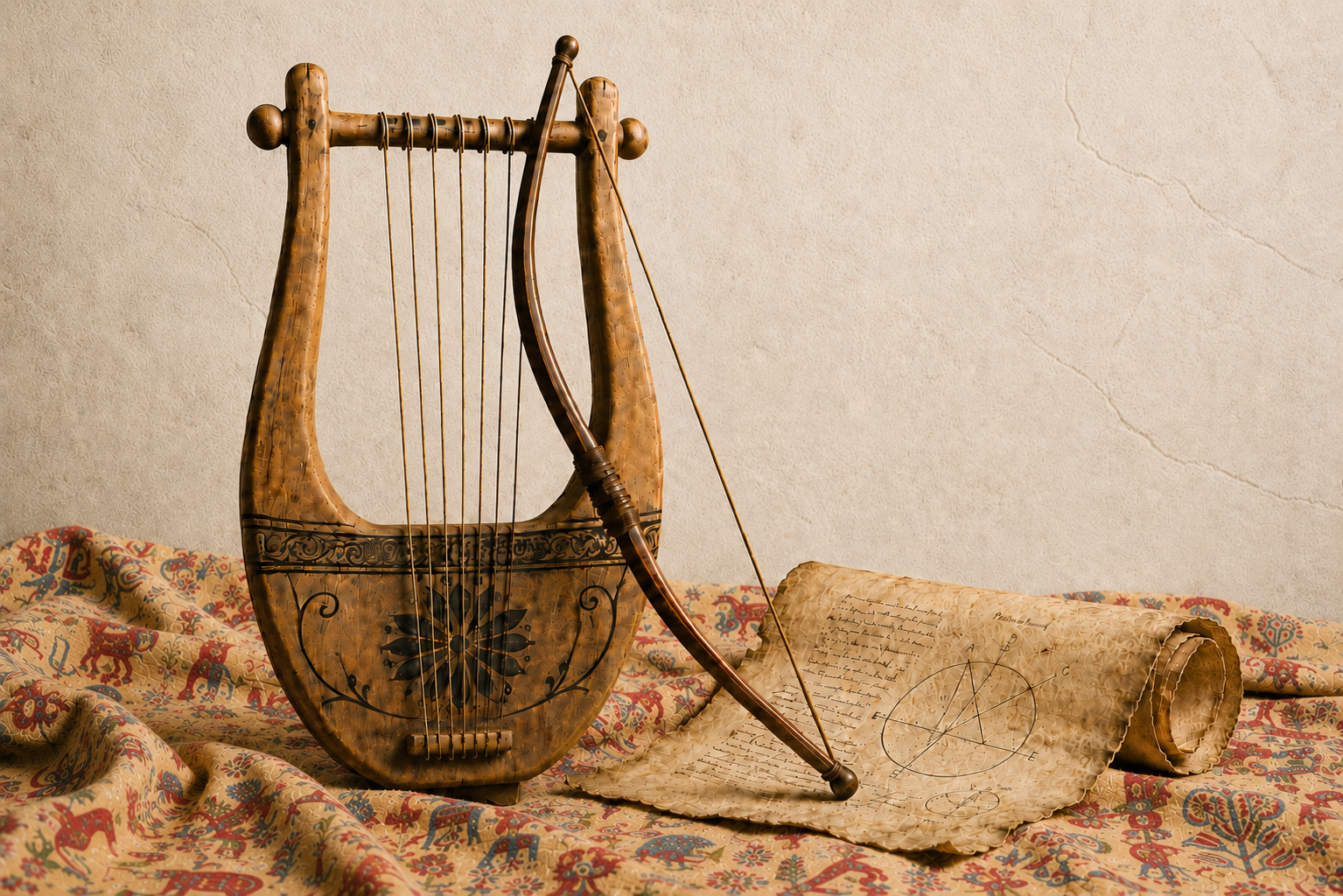
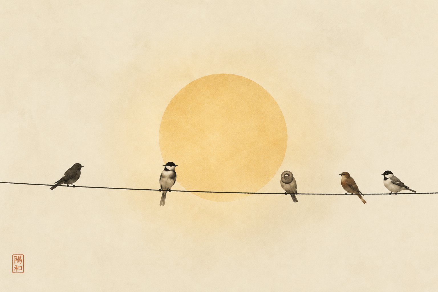
Heraclitus’ Bow and Lyre: A Visual Interpretation. Concept and art direction by the author. Generated with AI.
Heraclitus took the idea in a different and provocative direction. He saw opposition itself as fundamental to the way the world works and brought the idea to life through the metaphor of the bow and the lyre. In both, opposing forces are held in tension: the string pulls against the curved structure, yet neither force cancels the other. Their opposition is precisely what allows the object to function. In the bow, tension produces force; in the lyre, it produces music. Harmony, in this sense, does not come from eliminating opposition, but from holding opposing forces in a productive relationship.
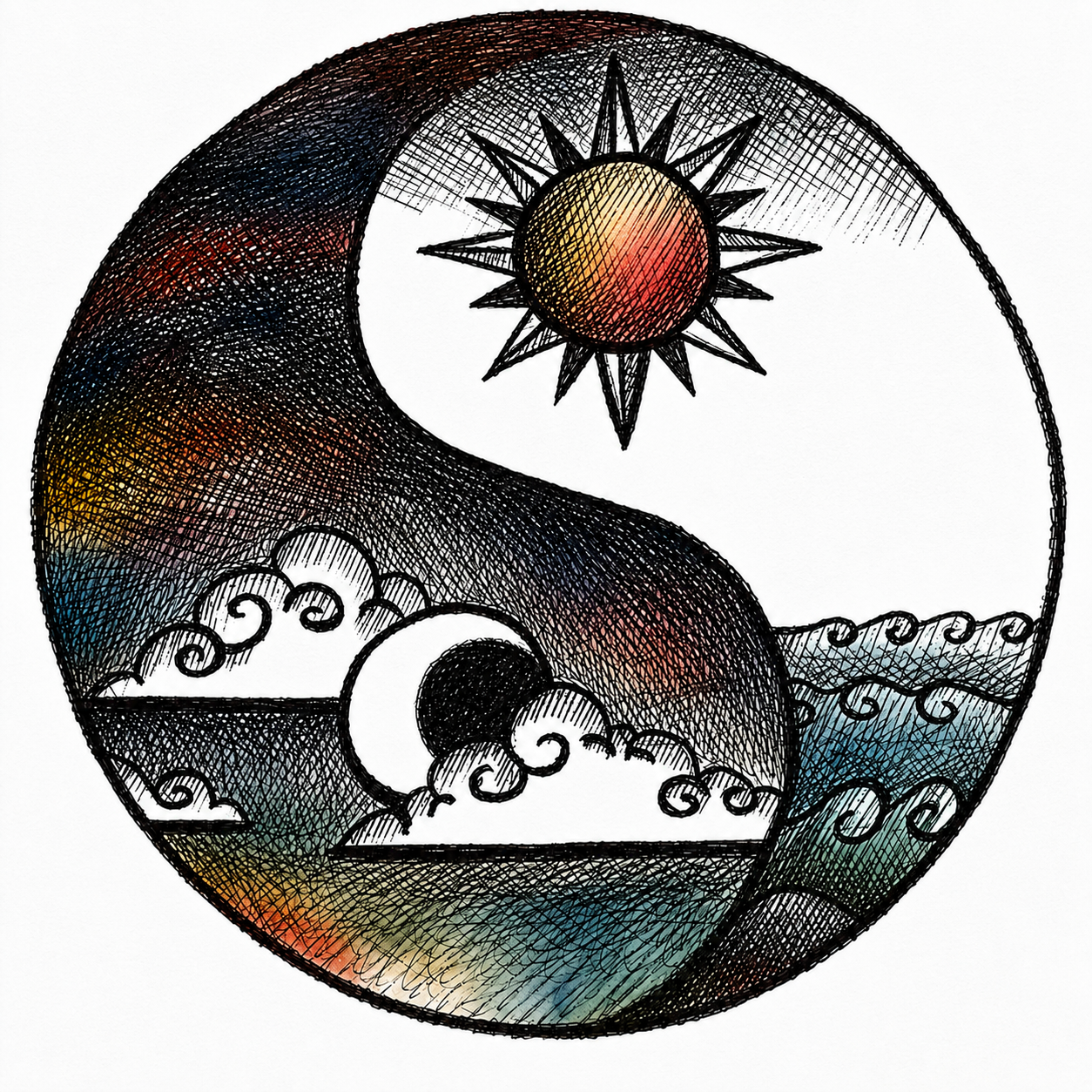
Yin-Yang: A Visual Interpretation of Opposing Forces
Original source unknown; image has circulated widely online for many years. Color treatment by the author.
A remarkably similar distinction appears in ancient Chinese thought. Confucius observed that the junzi — the exemplary person — “harmonizes but does not seek sameness,” while the lesser person seeks sameness without achieving harmony.
Design researchers J. Derek Lomas and Haian Xue explore this distinction in their wide-ranging study of harmony in philosophy, science, and design. As they point out, harmony is not uniformity.
Harmony involves the integration of diverse elements into a larger whole.
Difference, Organization, and Reconciliation Are Not the Same Thing
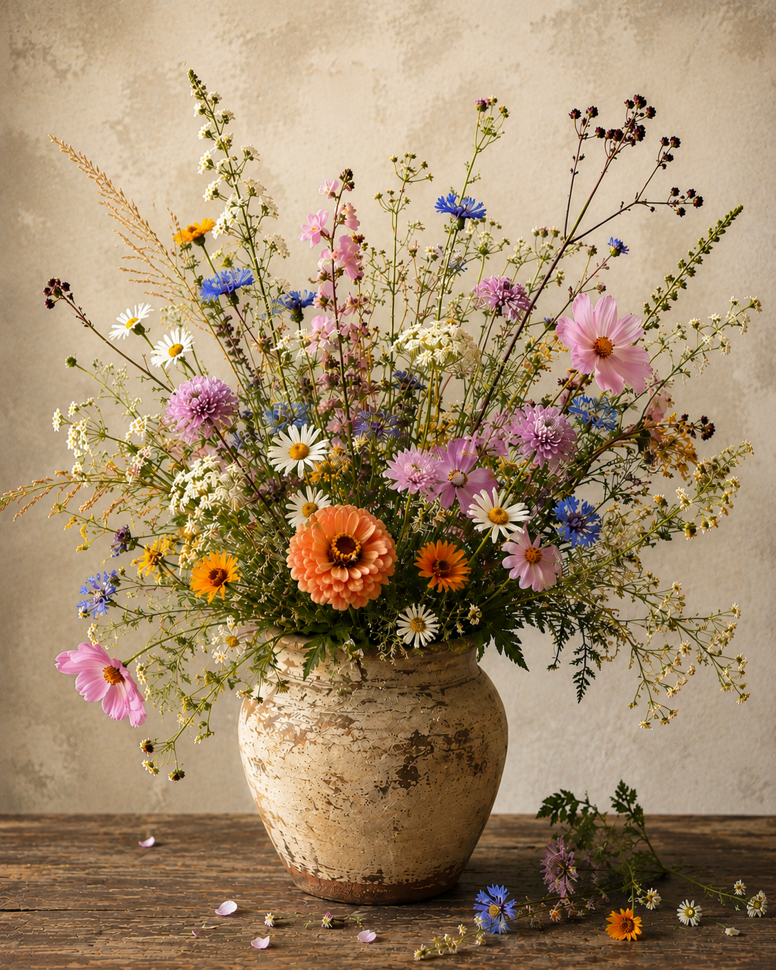
Variety in Harmony. Concept and art direction by the author. Generated with AI.
Before going further, it helps to separate a few ideas that are often treated as interchangeable.
A design can contain a great deal of difference without containing true opposites. Different colors, forms, materials, scales, or textures may simply create variety. When those differences are arranged so that they feel related rather than random, they become organized into a larger whole. That matters. In fact, it is one of the foundations of harmony and unity. But it is not quite the same thing as the union of opposites.
Contrast emphasizes difference and creates opposition, setting contrary qualities against one another. Reconciliation goes further: it allows two contrary qualities to remain perceptible while still participating in a satisfying whole.
The goal is not to minimize or dilute the difference between them. If traditional becomes completely modern, or rough becomes completely refined, there is no longer an opposition to reconcile. The interest comes from the fact that both qualities remain present and, in some way, work together to create coherence.
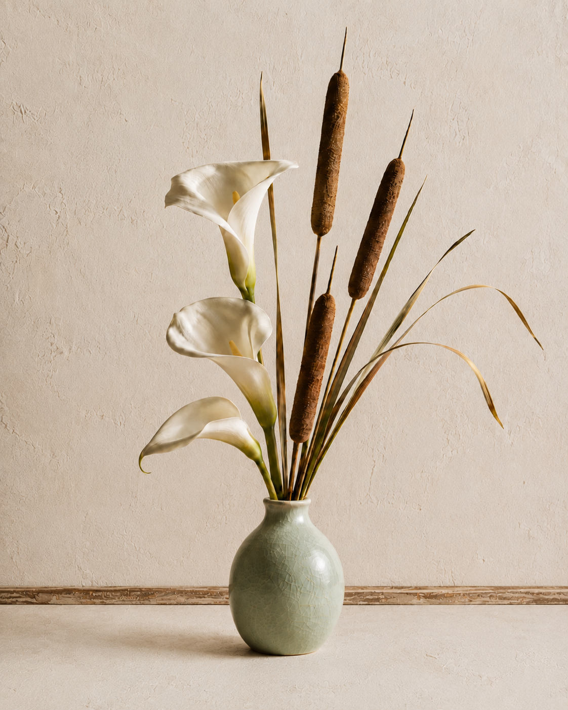
Reconciliation of Opposites. Concept and art direction by the author. Generated with AI.
For reconciliation to occur, the opposing qualities must find some point of relationship — something that allows them to engage with one another rather than simply exist side by side. That relationship might arise through form, proportion, scale, rhythm, color, material, or another shared visual quality. The connection need not be obvious. It simply needs to be strong enough to bring them into relationship while allowing their differences to remain intact.
This is what makes the choice of opposites important. Two very different things do not automatically make a compelling pair simply because they are different. Their opposition creates the tension; the relationship between them makes reconciliation possible.
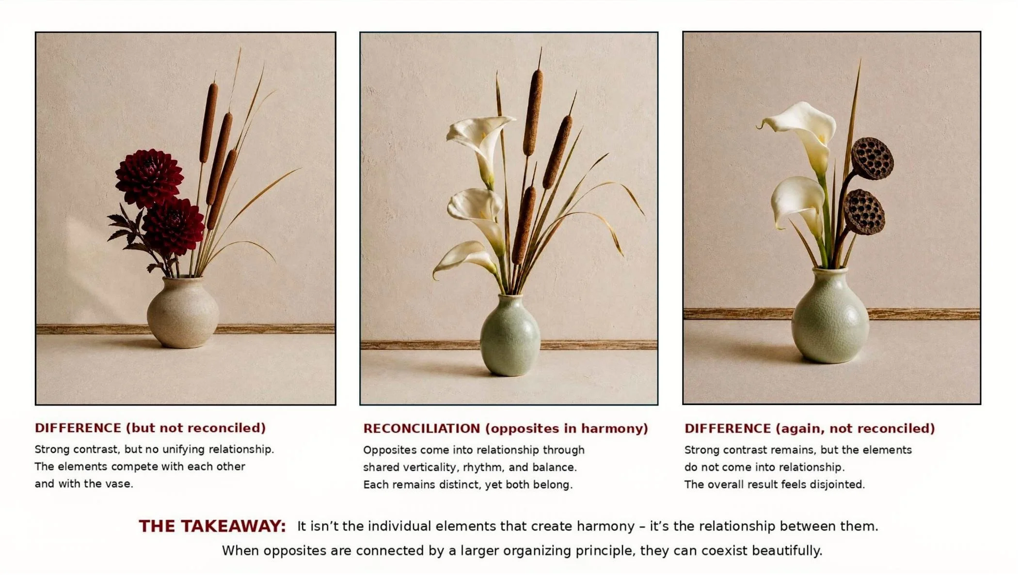
When it’s reconciled, and when it’s not. Concept and art direction by the author. Generated by AI.
So the union of opposites is not simply about variety, and it is not simply about contrast. It is about creating a relationship strong enough that two seemingly contradictory qualities can enhance one another without losing what makes each distinct. That distinction matters, because not every mixed style, eclectic interior, or contrasting composition represents a true union of opposites.
Creativity: Making Connections
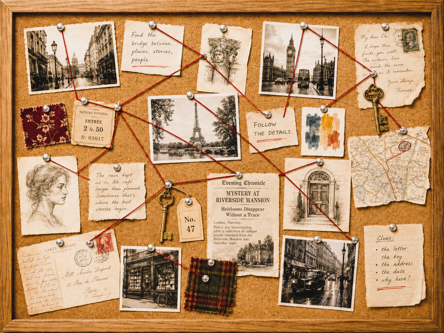
Connecting the Dots: A Visual Interpretation. Concept and art direction by the author; generated with AI.
Creativity is often described as the ability to make connections between things that at first seem unrelated — to recognize a possibility or relationship that was not previously obvious. (For more on the role that making connections plays in creative thinking, see Connecting the Dots: Making Connections).
Mihaly Csikszentmihalyi, whose work we discussed earlier in relation to creativity, emphasized that creative ideas do not arise in isolation. They emerge through connections among knowledge, experience, culture, and the possibilities available within a particular field. (For a deeper exploration of creativity—how ideas emerge, connections are made, and inspiration develops into intention—see Creativity in Design: From Inspiration to Intention and Creativity in Design: Before the Spark).
Writing about imagination, sociologist and creativity scholar Peter Murphy brings that idea directly into design with what he refers to as its “organizing power of form.” Drawing on Pre-Socratic and Platonic thought, he describes creation as “a union of opposites achieved through the power of forms.”
Here, form does not mean three-dimensional shape. Think of it instead as an organizing framework — almost like a scaffold or grid — that establishes relationships among different elements. It can arise from visible qualities such as line, shape, color, texture, proportion, or rhythm. It can also be established by a larger theme or idea, the most significant for a designer being the project concept.
Within that framework, things can be arranged in different proportions, hierarchies, rhythms, balances, and compositions. The framework does not erase their differences; it gives those differences a structure in which they can make sense together. So contrary qualities can remain distinct within a unifying context.
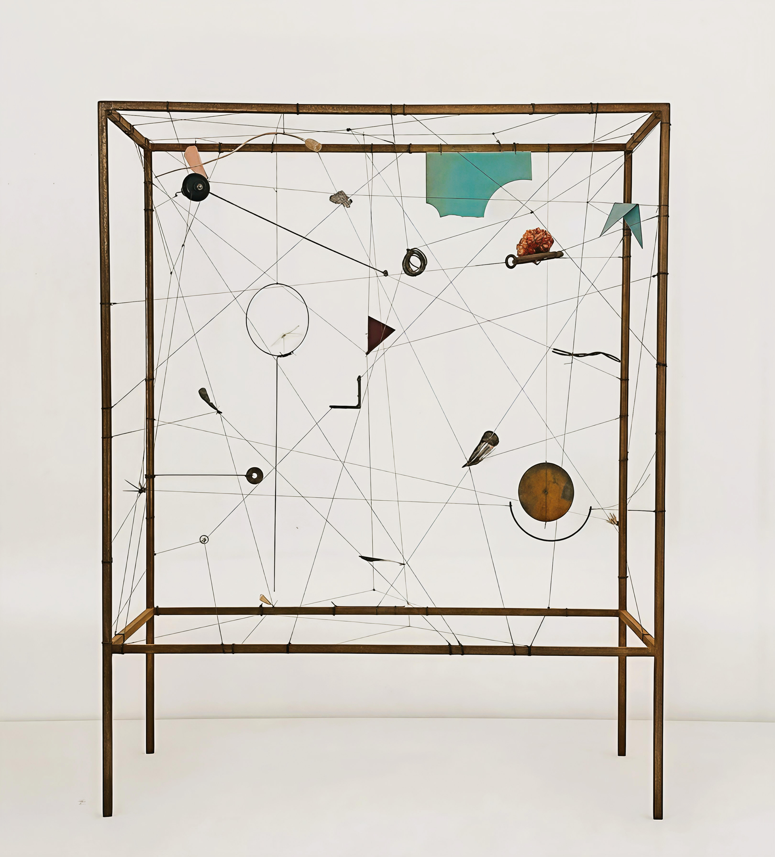
Constellations. Original artwork by Maria Edwards. This piece beautifully symbolizes the “framework of creativity.” Image courtesy of the artist. Web site: https://mariaedwards.cl/, Instagram: https://www.instagram.com/mariaiedwards/
The union of opposites works on the same principle, though it can be more challenging than organizing variety. When dealing with only two highly distinct entities, both remain conspicuous. Selecting them — and discovering a convincing relationship between them — can therefore require considerable discernment and creativity.
Why Does This Work?
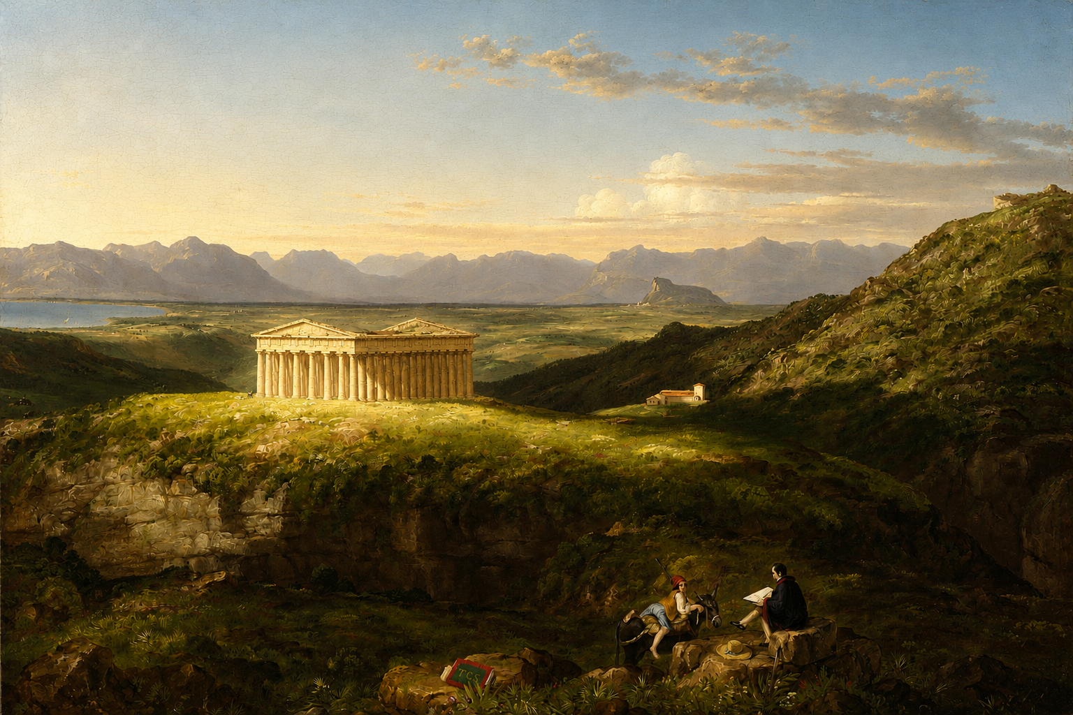
The Temple of Segesta with the Artist Sketching. Thomas Cole. 1843. Image courtesy of the Museum of Fine Arts Boston. Object number 33070. Wiki Commons public domain.
If the union of opposites appears so persistently across philosophy, creativity, and design history, the next question is obvious: why does it appeal to us?
Part of the answer may lie in the way we perceive order. Research in aesthetics and neuroaesthetics suggests that we are drawn to qualities such as balance, coherence, symmetry, and pattern. We look for structure; we want to be able to understand what we are seeing.
But perfect regularity is not always the most engaging condition. Variation, asymmetry, complexity, novelty, or an element of surprise can hold our attention and make an experience richer. Too much order can become predictable; too much variation can become chaotic.
The most compelling design often seems to occupy the territory between those extremes. The union of opposites can do exactly that: it gives us enough coherence to perceive a whole while allowing difference or surprise to remain active within it. We recognize that the parts belong together, but we are also aware that they are not the same.
That may be part of what makes the result so satisfying: we experience order and surprise at the same time.
There is no single formula for achieving this. The opposing qualities must remain perceptible, and some larger organizing relationship must connect them — perhaps concept, proportion, rhythm, material logic, hierarchy, repetition, or spatial structure. One quality may dominate while the other plays a smaller but important role. That relationship may be deliberately constructed or unexpectedly discovered.
Sometimes things simply come together by accident — and suddenly, they work.
That element of serendipity can be part of what gives the result its particular vitality. But serendipity is only useful if the designer recognizes the possibility revealed.
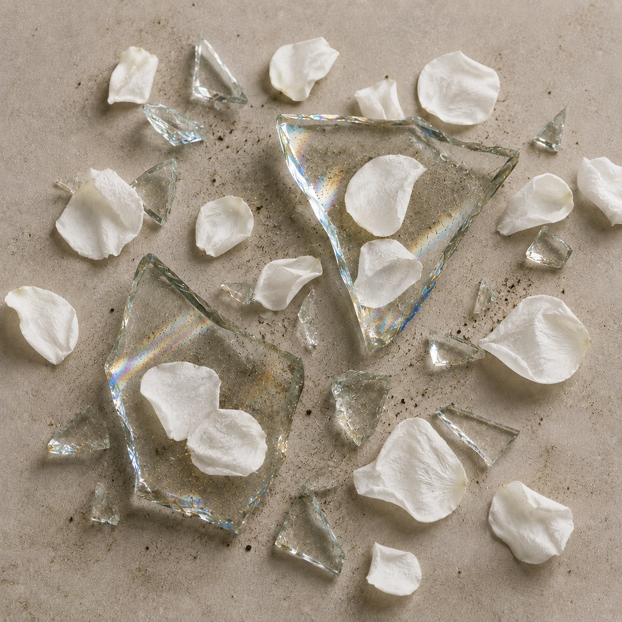
The Magic of the Accidental. Concept and art direction by the author. Generated with AI.
Concept may be especially important because it can give the opposing qualities a reason to be there in the first place; the formal devices give that idea visual structure. But whether planned or discovered, what matters is that the relationship is strong enough for the opposing qualities to be perceived as parts of the same whole.
How Does This Work in Practice?
Designers are not always at liberty to choose one thing or another from a clean slate. They are often faced, on one hand, with existing conditions that express a particular aesthetic and, on the other, with a client’s wish for something new — as well as the designer’s own desire to produce a distinctive and creative solution.
At first the conditions may seem irreconcilable: follow what is already there, or remove it and begin again. But it doesn’t have to be an either-or decision. The more imaginative response may be to ask whether a meaningful relationship can be established between the existing and the new.
The more interesting question is not simply Which one? but What becomes possible when we introduce an opposing quality? And in what proportion?
Modernity added to the traditional. The handmade to the industrial. Ornament to the minimal. The antique to the modern.
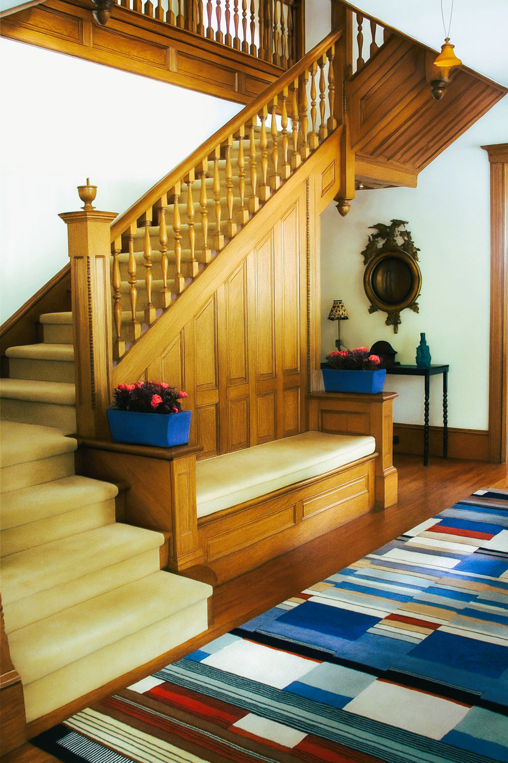
Interior design and photography by the author.
For an early twentieth-century Victorian/Arts and Crafts house, the client wanted, in his words, a “quirky” vibe. The rug chosen for the entry hall does exactly that, while maintaining a level of sophistication worthy of the location and price of the property.
Made by Christopher after a Bauhaus design by Gunta Stölzl, c. 1920, stylistically it may appear to be the complete opposite of Arts and Crafts. But there is a “framework” that unites them: the story of Design Reform and how it led, eventually, to the Bauhaus. (For more on that story—and how Design Reform helped lay the groundwork for the Bauhaus—see Intro to Design Reform: What is Design Reform, and How Did It Start?)
That framework is reinforced by the fact that the rug also satisfies the “quirky” part of the program. And finally, it doesn’t hurt that its composition of rectangles happens to reflect the wood paneling.
All of these relationships are why it works—why this rug, out of all the rugs in the world, was chosen.
The same approach can be useful when existing conditions are eclectic. Would the new design become stronger if the number of competing aesthetics were reduced to the two most promising? And when starting with a clean slate, does the concept really call for only one aesthetic language? Or might it be expressed more meaningfully through a carefully chosen pairing?
The point is not to mix for the sake of mixing. It is to identify a relationship with enough meaning and visual logic to support the whole.
Seen this way, the union of opposites belongs to the larger process of creativity itself.
Creativity is the ability to discover connections where none were immediately apparent and, through an organizing framework, to make those connections meaningful.
The next room is a subtle but good example of this.

Interior design and photography by the author
In the same Victorian/Arts and Crafts house, two major antique cabinets were chosen for the dining room. This French cabinet-on-stand of c. 1600 is one.
Why choose this? First, the client wanted to invest in some authentic period pieces. Second, this is one hundred percent handmade and similar in form and function to the kind of pieces that inspired many of the original Arts and Crafts designers—such as William Morris, C.F.A. Voysey, and Gustav Stickley—who were looking back in time to eras of handmade furniture for inspiration. So thematically, it “works” with the house.
Of course, the Arts and Crafts designers preferred the Middle Ages for its purity, but this was as close as I could get! The custom table, however, sits on X-shaped trestles, and the natural-toned jute rug recalls the straw that covered the floors in Medieval halls.
As for the “opposing” elements, my favorite is the three pieces of mid-twentieth-century black Roseville pottery sitting on top of the cabinet in exactly the manner that prized blue-and-white porcelain from China would have done in the seventeenth century. They are opposed only in that the cabinet is old and the ceramics are new. But the meaningful relationship between them is much stronger and more interesting.
Pottery—inexpensive and otherwise—was used as ornament here and there in the house because of its links to the Arts and Crafts period and style.
Those very affordable, fun, manufactured pieces are offset by their opposite: the one-of-a-kind, rare, and expensive piece of mid-century Murano tesserae glass sitting in the middle of the table. A prized possession of the owner, this seemed the perfect place for it. But the only relationship there in terms of design is visual: color and geometry. It fits. It works.
The principle becomes easier to see when we look at design history. Again and again, designers have created something new, not by choosing between two apparently opposing traditions or values, but by bringing them into relationship.
Historical Examples: Classic Combinations
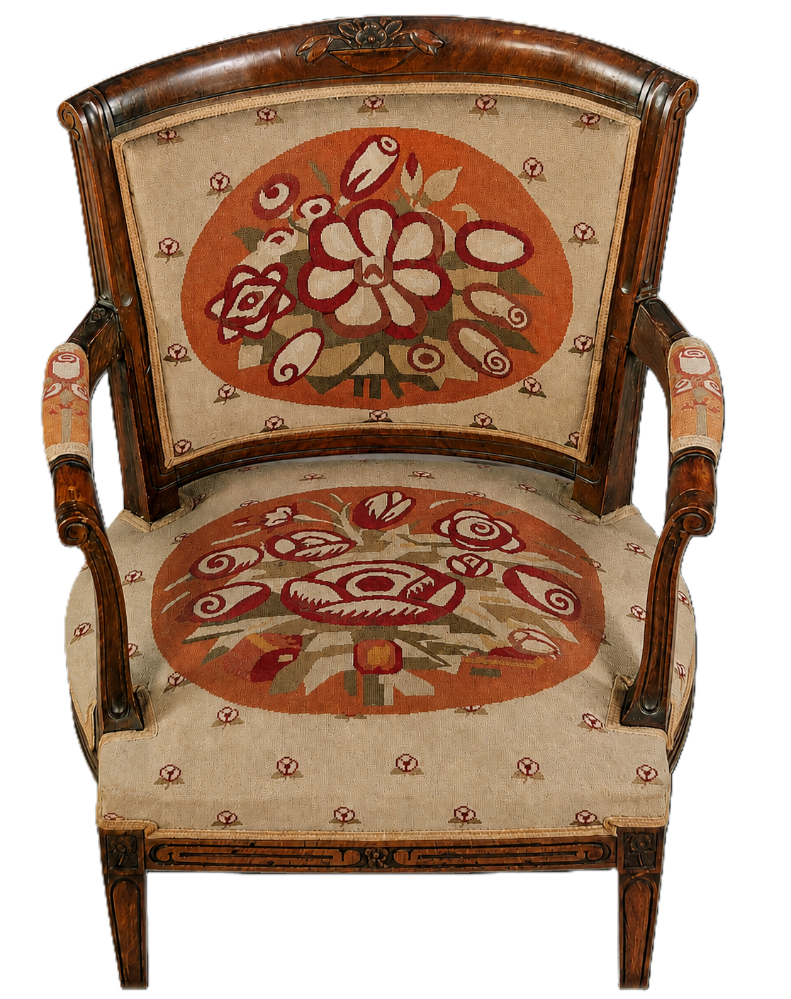
Chair from the Bedroom of the Maison Cubiste. André Mare and Marie-Thérèse Lanoa, after Paul Vera. 1912. Paris. Image courtesy of Saint-Germain-en-Laye, Maison Natale Claude-Debussy
Amid a heated battle with Germany in the opening decades of the twentieth century over who would create the new style for the new century, France made a deliberate, strategic decision based on a particular formula: Tradition + Modernity.
France would build upon its great strength — its heritage as the world leader in luxury decorative arts and exceptional craftsmanship, with a distinctly French identity — while embracing the rapidly changing culture of the early twentieth century: electricity, manufacturing, speed, jazz, new materials, and avant-garde painting, among many other influences. That breadth helps explain why the term Art Deco can encompass such a striking variety of appearances.
But in the strongest French examples, emerging before the First World War and developing through the 1920s, both poles remain discernible. The question is where a particular work sits along the continuum between them.
The chair shown here is a superb early example of the aesthetic this formula produced. Its frame is fundamentally traditional, evoking the transition between eighteenth-century Neoclassicism (Louis XVI) and nineteenth-century Late Neoclassicism (Louis-Philippe) -- both well known and loved in France. Its form and materials are equally familiar — a wooden frame with carved ornament, four legs, two arms with manchettes, and needlepoint upholstery.
Of course, handmade needlepoint and the floral imagery are emblematic of eighteenth-century French upholstery and culture, as bouquets of flowers would have immediately called to mind both Madame de Pompadour and Marie Antoinette. Both were, again, intended to appeal to the heart of what it means to be traditional and French. But the style of the imagery is completely and unabashedly new – modern.
Designed by the artist Paul Vera, its forms and colors reflect the extraordinary experimentation taking place among the Parisian avant-garde at the time, particularly Cubism. Applied to the traditional frame, designed by his close friend and fellow artist André Mare, the upholstery represents not only modernity but also something distinctly French: the cutting-edge art scene of which Paris was then the world center.
This reconciliation is exactly what gives Art Deco not only its richness but its broad appeal. It can be modern without rejecting tradition, traditional without becoming purely historicist, and innovative without abandoning craftsmanship.
Scandinavian Modern: Craft and Industry
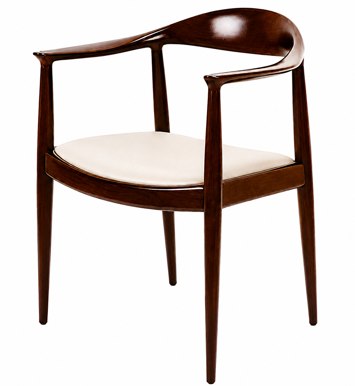
JH503 Round Chair. Hans J. Wegner, 1950. Manufactured by Johannes Hansen, Denmark. Wiki Commons public domain. Later nicknamed The Chair, suggesting it was the most perfect chair ever made.
Scandinavian Modern design offers another excellent example in its introduction of seemingly opposing qualities into Modernism. Its enormous influence on what we now broadly refer to as Mid-Century Modern design makes the Scandinavian response particularly significant. These designers admired the minimal, universal forms developed at the Bauhaus, but often found its industrial materials — tubular steel and glass — too hard and cold. They responded by bringing long traditions of craftsmanship, natural materials, tactile surfaces, and a concern for human comfort to Modernism’s functionalism, simplified forms, and embrace of modern production.
Hans Wegner’s JH503 Round Chair of 1950 beautifully demonstrates the result. Its form is unmistakably Modern: minimal, functional, devoid of ornament. But instead of tubular steel, its structure is formed in wood, shaped and joined with the skill of traditional cabinetmaking. Modern machinery assisted its production, but extensive hand craftsmanship remained essential. The hand-shaped sculptural treatment of its structural elements brings a distinctly humanist quality to the chair, while also providing an integral — that is, “authentic” — form of ornament.
The result is not simply Modern design made warmer, nor traditional craft made more modern. It is a reconciliation of values that might otherwise appear opposed: industrial production and hand craftsmanship, universal form and natural material, rationalism and humanity.
These examples differ greatly in appearance and historical context, but they share a deeper strategy. In each case, the power comes not from suppressing difference, but from allowing distinct qualities to remain visible while giving them a new relationship.
That is what makes the union of opposites more than eclecticism. Eclecticism can place unlike things side by side. Reconciliation creates a new order in which their differences become part of the design’s meaning.
The Continuum
A Continuum. Concept and art direction by the author. Generated by AI.
The union of opposites does not require equal parts.
A design does not have to be fifty percent one thing and fifty percent another for both qualities to shape the result. One may dominate while the other appears only as a counterpoint. That is why it can be more useful to think of many design qualities as existing on a continuum rather than as fixed categories. Some of the common “opposite” qualities are:
Traditional — Modern/ Contemporary
Ornamented — Restrained
Organic -- Geometric
Craft — Industry
Formal — Informal
We use categories because they help us describe what we see. And of course, certain “styles” are closely associated with certain qualities, and therefore, certain categories. So we often speak in terms of combining different styles.
Two Extremes: Modernism and Post-Modernism
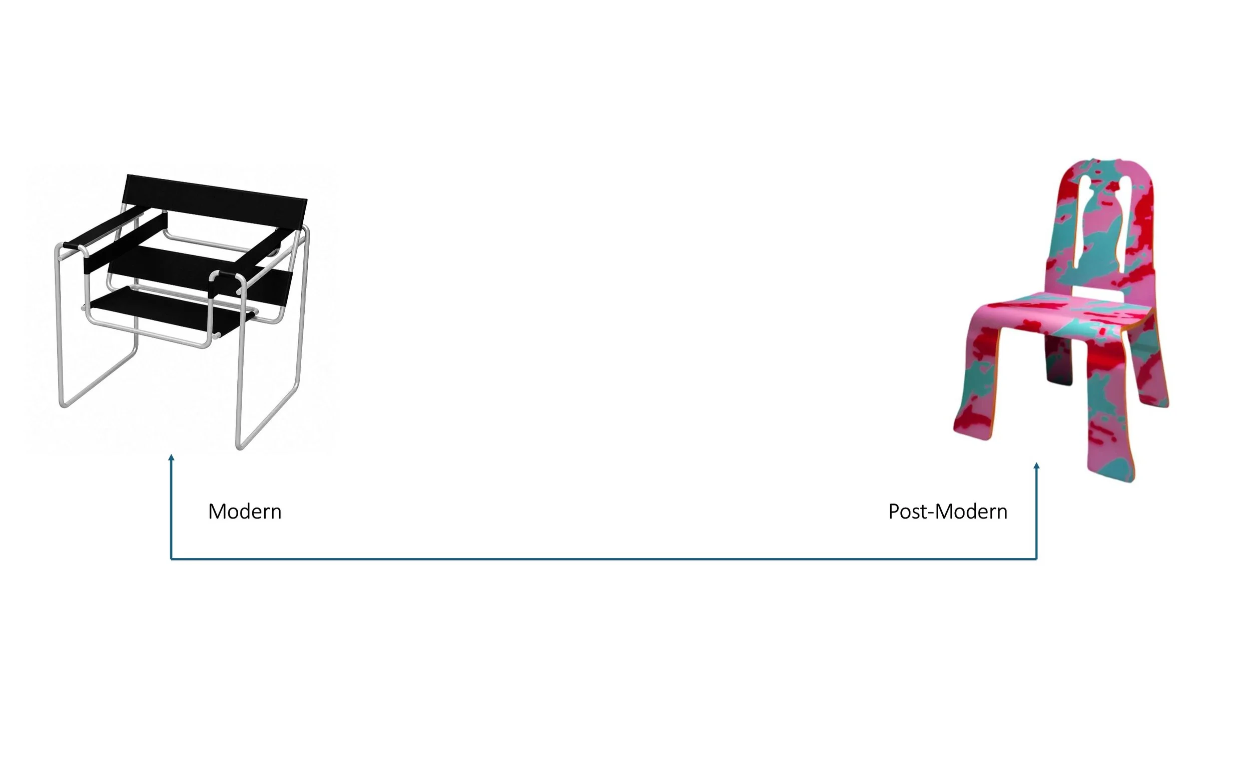
Opposite Ends of the Continuum. Created by the author. Image credits: Left: Wassily Chair. Marcel Breuer. 1925. Germany. Public Domain via Wiki Commons. Right: Queen Anne Chair with Paola Navone Print. Robert Venturi and Denise Scott Brown. 1984. United States. Image courtesy of Dezeen. For more about the Post-Modern chair and its designers, see: article https://www.dezeen.com/2015/08/17/postmodern-design-queen-anne-chair-robert-venturi-denise-scott-brown
As an extreme example, consider Modernism and Postmodernism. In their most polemical forms, they deliberately positioned themselves at opposing ends of several important continuums.
Modernists fervently rejected historicism, applied ornament, and much of the decorative language of the past in favor of abstraction, functionalism, clarity, and a new visual and universal language suited to modern life.
Decades later, Postmodernism rejected that position just as emphatically. It reintroduced historical reference, symbolism, ornament, color, and stylistic complexity, while adding humor, irony, and wit —precisely because Modernism had excluded them.
Neither movement, at those extremes, was seeking reconciliation. Each deliberately claimed a pole.
But design did not remain there. Once the Modernist prohibition against historical reference had been broken, designers became free to combine what had previously been treated as incompatible — borrowing Modernist clarity or materials, while reintroducing historical reference, combining restraint with ornament, or merging abstraction with symbolism. What had once been framed as mutually exclusive could become material for synthesis.
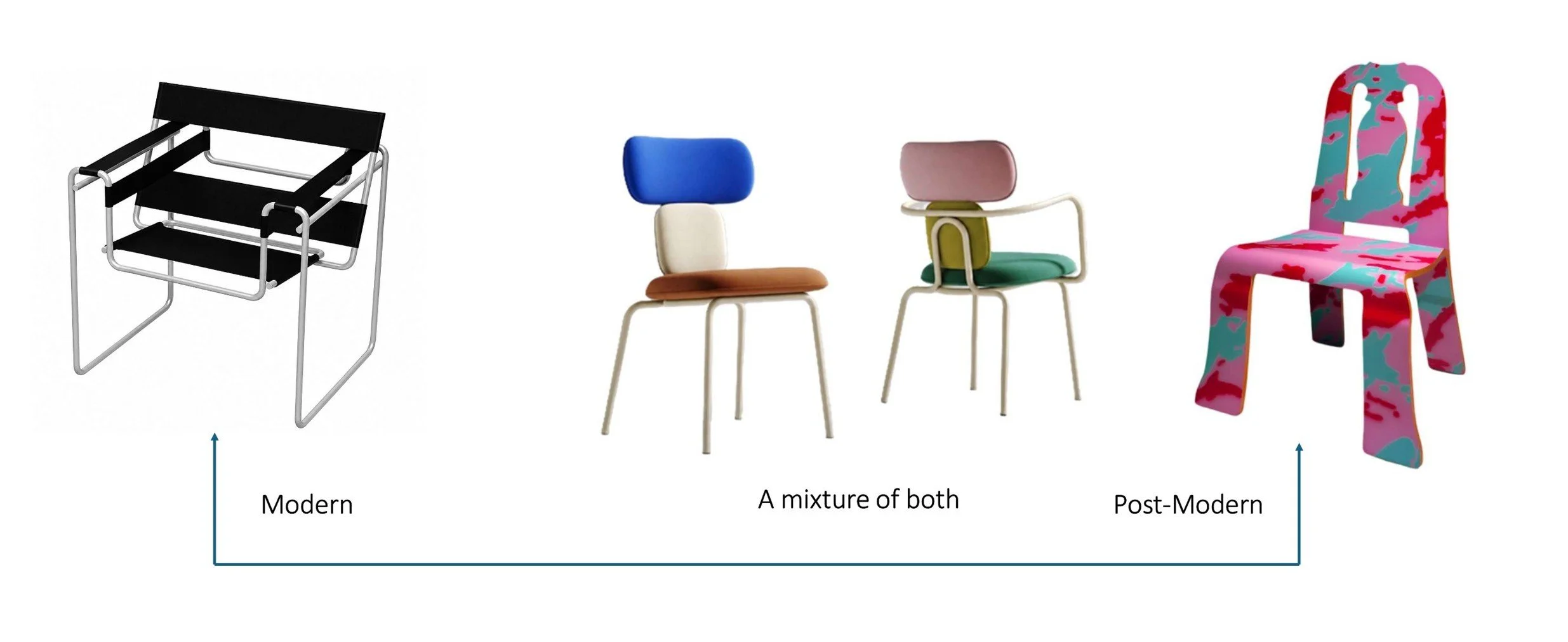
Created by the author. Image credits: Left: Wassily Chair. Marcel Breuer. 1925. Germany. Public Domain via Wiki Commons. Right: Queen Anne Chair with Paola Navone Print. Robert Venturi and Denise Scott Brown. 1984. United States. Image courtesy of Dezeen. For more about the Post-Modern chair and its designers, see: https://www.dezeen.com/2015/08/17/postmodern-design-queen-anne-chair-robert-venturi-denise-scott-brown-knoll/. Center : Balance Chair. Pavel Vetrov. 2026. Ukraine. Image courtesy of the designer. https://pavelvetrov.com/portfolio-item/balance/.
The example here shows the chair at a 50/50 combination of qualities. Inherited from Modernism: Minimal, geometric forms (softened), a metal frame, pointing to industrial materials. From Post-Modernism: while the list isn’t long, the one item – color – is a significant part of the design -- even to making the metal frame white. And of course, not on the continuum is what this designer brings to the chair himself: the elegance and exacting proportions. I highly recommend reading the designer’s concept and description of this chair.
The Union of Opposites Does Not Require Equal Parts
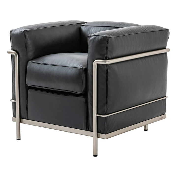
Fauteuil Grand Confort, Petit Modèle (LC2). Le Corbusier, Pierre Jeanneret, and Charlotte Perriand. 1928. France. Wiki Commons public domain. https://commons.wikimedia.org/wiki/File:SW_LC4_LeCorbusier.jpg . Enhanced for editorial purposes.
Charlotte Perriand was a founding member of the Union des Artistes Modernes, a group of Modernist designers in Paris whose work shared some of the functionalist and experimental concerns of the Bauhaus. Yet their work could also retain a greater sense of human comfort and, at times, color and luxury. In a way, it was Modernism touched by Art Deco. No surprise: they were French designers working in Paris at a time when Art Deco was at its peak.
The center of a continuum is only one possibility. In reality, design rarely divides itself neatly into equal parts. Most work occupies some position between the poles, and that position can shift dramatically. A design does not have to be fifty percent one thing and fifty percent another for both to produce a satisfying result.
Referring back to the example here, rather than a 50/50 mix, an object might be predominantly Postmodern, with just a dash of Modern restraint to tone it down without sacrificing its distinctly Postmodern character. Or it could work in the opposite direction: an essentially Modern design might incorporate a touch of ornament, historical reference, or expressive color.
What matters is how the two interact within the whole—whether one dominates, whether the other acts as a counterpoint, whether both reinforce the same concept, or whether they create productive tension. Equal balance is not required for both to shape the character of the design.
But combining opposites doesn’t have to mean combining “styles.” It can, and usually does, mean a combination of qualities.
Styles or Qualities?
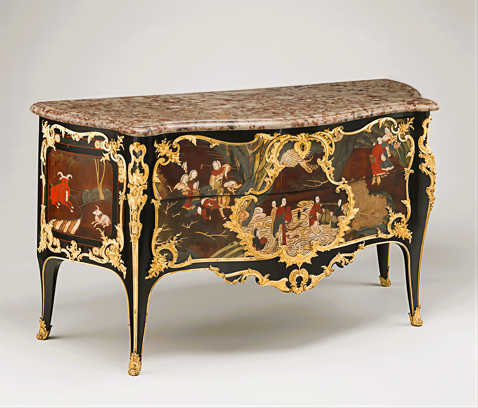
Commode. Bernard Van Risenburgh. c 1740-45. Paris. Oak veneered with panels of Chinese Coromandel lacquer and European black-lacquered veneer; gilt-bronze mounts; brèche d'Alep marble top. Public domain courtesy of the Metropolitan Museum of Art. Object number 1974.356.189
Combining opposites does not necessarily mean combining two identifiable styles. More often, what designers actually combine are qualities.
Some common opposing qualities include:
Traditional — modern/contemporary
Ornamented — restrained
Organic — geometric
Craft — industry
Formal — informal
East — West
We often describe these combinations in terms of styles because styles give us a convenient shorthand. But what designers actually combine are the qualities associated with them: the ornament of one, the restraint of another; the craftsmanship of one, the materials of another; the geometry, color, symbolism, form, or cultural references of any and all are available. That distinction greatly expands the possibilities.
The French commode shown here, for example, does not represent the reconciliation of two opposing historical styles. Instead, it brings together two very different cultural and aesthetic traditions: East and West. The qualities of both remain recognizable, but they have been brought into a new relationship within a single object.
It also recalls an important point made earlier: it is essential to determine which two qualities can be combined successfully. And this eighteenth-century French design offers a particularly vivid example of success.
The fascination with China and East Asia brought unfamiliar motifs, asymmetry, an interest in the organic, and new decorative forms at just the moment the West was reacting against the formality of the Age of Absolutism and the Classical vocabulary associated with it. Eastern influence paired readily with the lighter, more organic style developing in France in the early eighteenth century and was absorbed into the distinctly French language known today as Rococo, or Louis XV style.
The result was neither purely Eastern nor purely Western. The differences remained visible, but they were reorganized within a new whole — one shaped by a broader cultural turn away from the values and visual language associated with absolutism and strict Classicism.
The creative act was not simply the addition of an exotic influence. It was the transformation of two visual traditions into something that could not have existed in quite the same way without both.
A Related Idea: Transitional Style in Interior Design
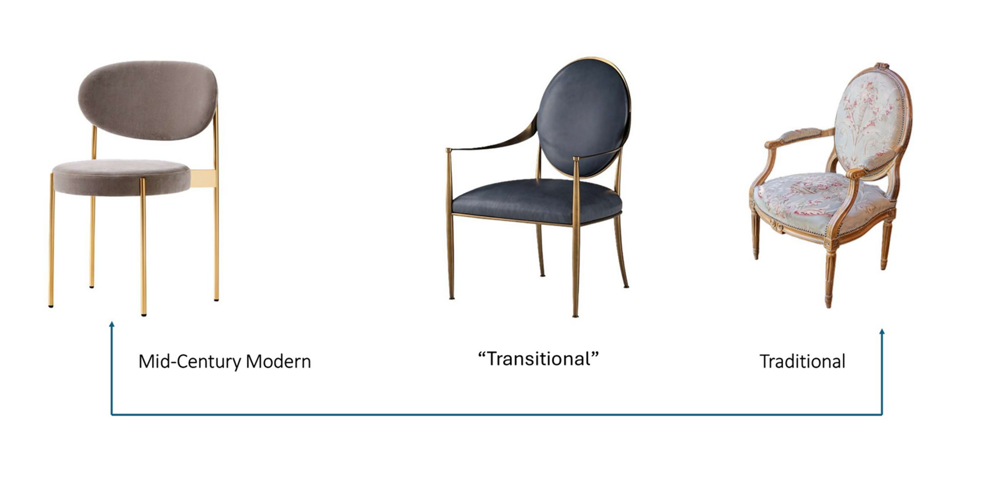
A Transitional Continuum. Image credits: Left: Series 430 Chair. Verner Panton. 1967. Image courtesy of danishdesignstore.com and verpan.com. Right: French Louis XVI Period 18th Century Armchair with Floral Tapestry Upholstery. Image courtesy of https://jacquelineadamsantiques.com. Center: Baker, Milling Road Ovolo dining armchair. Image courtesy of Baker/McGuire. bakerfurniture.com
The term transitional is widely — if not quite accurately — used in the design industry to describe a classic union of opposites: traditional and modern, whether Modernist or simply contemporary.
That usage is firmly established, so designers need to understand it.
Historically, however, transitional design has a broader meaning. It refers, quite literally, to a transition — the movement from one style or aesthetic toward another. Styles do not change overnight; they evolve, producing hybrids along the way. Design history is full of them: Renaissance moving toward Baroque, Louis XV toward Louis XVI, Classicism toward Late Classicism, and Art Nouveau toward Art Deco.
While historically, styles have often swung toward an opposite in their next evolution, not all transitions are a union of opposites. The transition from one expression of Classicism to another, for example, does not. But when the two poles are genuinely opposed — as they can be from Louis XV to Louis XVI or Art Nouveau to Art Deco — the transitional territory between them can itself become a union of opposites.
For designers, the continuum is therefore more than a way to classify styles. It is a tool for analysis. When you know what different styles look like — their qualities, characteristics, and underlying ideas — and can detect those traits within an object or interior, you become better able to judge its date, its influences, what it’s saying, and the kind of setting in which it might work best.
That, in turn, gives designers more room to think creatively — and brings us back to two central questions of design thinking:
What does it look like? Why does it look like that?
Those questions help us understand what a style, look, or aesthetic means — what it is communicating — and, ultimately, how to use that visual language intentionally ourselves.
Trends versus Principles
382323063 | A © Satusewudolar | Dreamstime.com
The larger lesson is not that designers should start looking for opposites to combine simply because the idea is interesting or because it produces a certain look. That would miss the point.
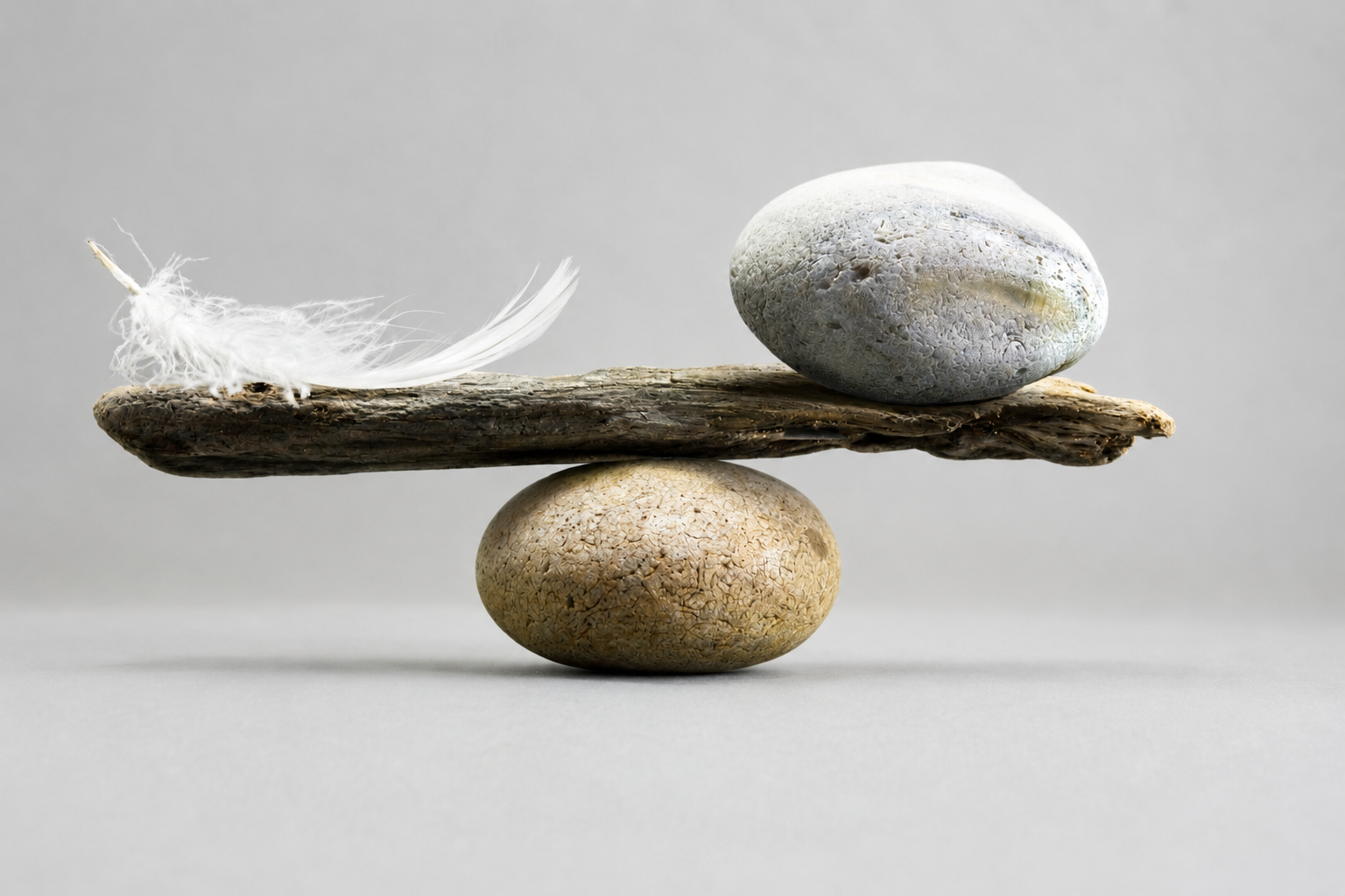
The value of the union of opposites lies in the fact that it rests on deeper principles — harmony, relationship, balance, dynamic equilibrium, creative association, and coherence. These ideas recur across philosophy, aesthetics, theories of creativity, and centuries of design because they address something more fundamental than style.
Trends tell us what is being done now. Principles help us understand why something works — why it is effective, why it has meaning, and why it can touch people.
A trend can be copied without being understood. A principle can be applied in countless different ways because it gives us a way to think rather than a formula to follow.
A trend is of its time. A principle can be timeless.
For that reason, making design decisions grounded in profound, established principles — principles that help explain creativity, harmony, and even the ordering relationships we find in the world around us — is a stronger path than simply following fashion.
That does not mean trends should be rejected. They can reflect genuine cultural shifts, new technologies, materials, changing ways of living, or simply introduce an element of surprise. But they are most useful when we understand the larger principles beneath them.
The union of opposites offers one way to accomplish this. Instead of allowing a trend to determine the whole, a designer might introduce it as a counterpoint within a more enduring framework — perhaps a predominantly traditional interior altered by a smaller measure of something distinctly current.
The point is not the percentage. It is the relationship. That is a far more durable basis for design.
Beyond Visual Style: Reuniting What Has Been Separated
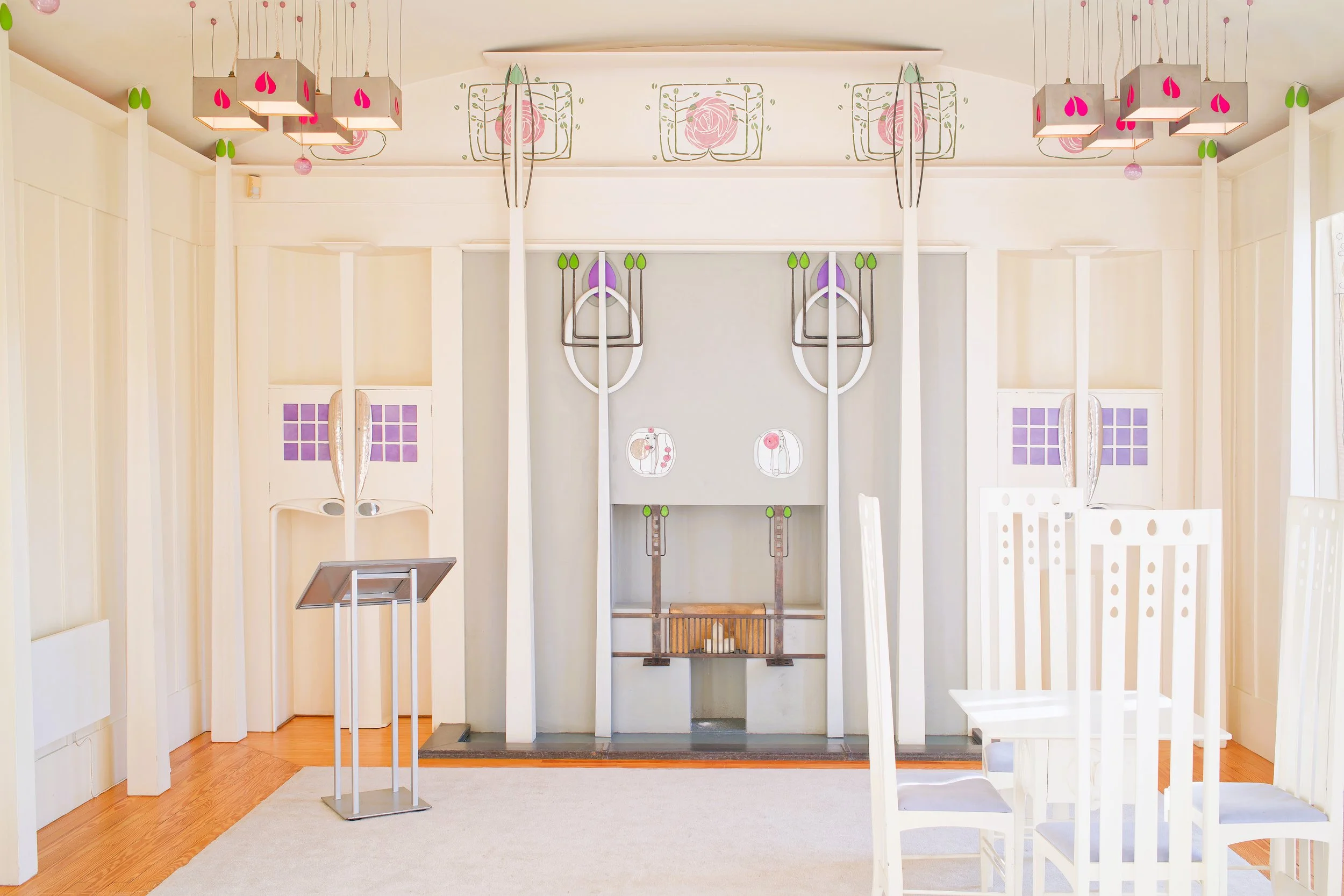
Mackintosh Queen’s Cross Church. Today, Charles Rennie Mackintosh Society. Charles Rennie Mackintosh. 1899. Glasgow, Scotland. Image @Richardjohnsonuk 429835947 Dreamstime.com
The union of opposites is not limited to visual qualities. Some of the most consequential oppositions in design history have been conceptual, cultural, or institutional:
Fine art / decorative art
Art / design
Craft / industry
Beauty / utility
Poetic / practical
These divisions can become so familiar that they begin to seem inevitable. But many are historical constructions — categories that were separated, ranked, or treated as incompatible at particular moments in time.
Again and again, artists, designers, and reformers have challenged those divisions by trying to reunite what had been separated.
The nineteenth-century Design Reform movement offers one clear example. Faced with the consequences of industrialization, designers and theorists questioned the widening divide between art and design, hand-made and machine-made, beauty and utility, the fine arts and the decorative arts. Some responded by favoring one side over the other; others searched for ways to bring them back into relationship.
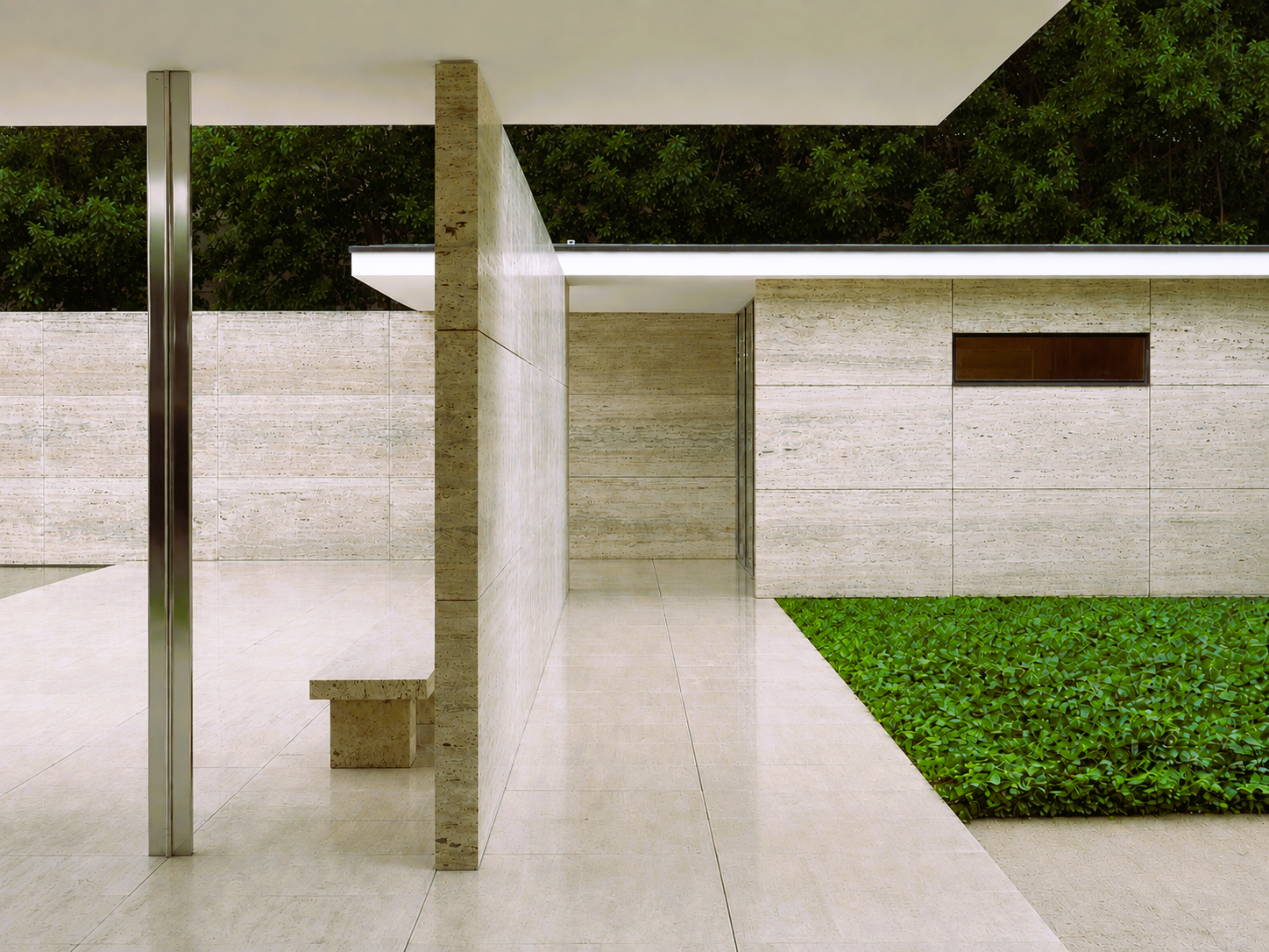
Detail of the Barcelona Pavilion. Ludwig Mies van der Rohe. Barcelona, Spain, 1929. Wiki Commons public domain.
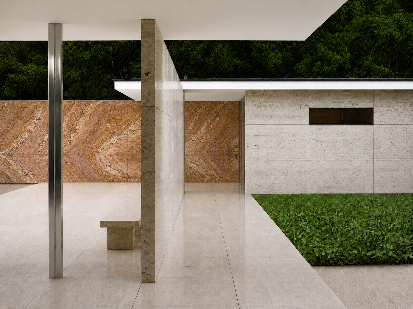
Sorry! I couldn’t resist! IYKYK. Only because we are talking about the meeting of “fine art” (in this case architecture) and “design.” This view is like an abstract, geometric painting. And adding the orange onyx back wall serves to enhance that idea. Also, an important reminder: Views, views, views. Detail of the Barcelona Pavilion. Ludwig Mies van der Rohe. Barcelona, Spain, 1929. Wiki Commons public domain. Edited by the author.
That impulse continued into the twentieth century. The Bauhaus famously sought to bring art, craft, architecture, and industry into closer relationship. Other movements answered the problem differently, but the underlying question remained remarkably persistent: Must these things really remain separate?
That question reaches beyond style. It asks whether categories we have learned to treat as opposites might become more meaningful when brought back into relationship. And that idea leads directly to one of the central oppositions at the heart of Ryan Art & Design itself: art and design; the poetic and the practical.
Art/ Design, Poetic/ Practical
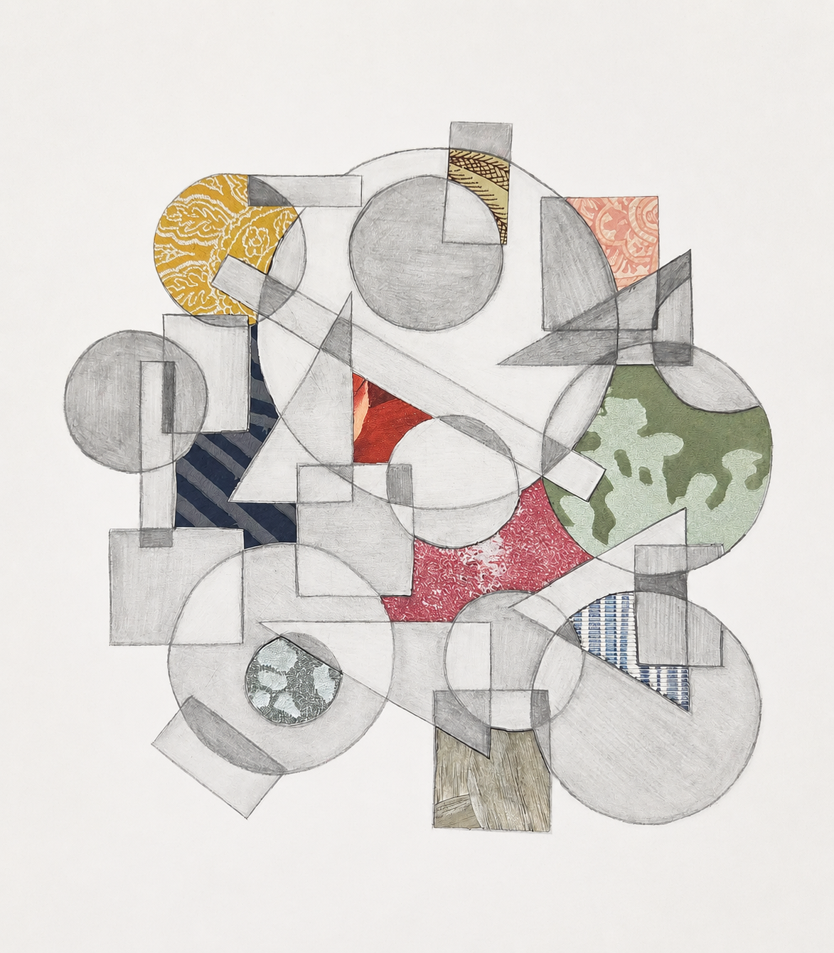
The Art of Space Planning. Student work by Erin, from an assignment developed by the author. © Ryan Art & Design. All rights reserved. No reproduction or reuse without permission.
For Ryan Art & Design, this is not simply an interesting historical pattern. It is the foundation of the whole project.
The name itself joins two disciplines that have often been separated: art and design. The tagline does the same in another way: Where the Poetic meets the Practical.
Of course, the boundaries between art and design are no longer what they once were. Over the past several decades, they have become increasingly porous, to the point that contemporary practice often moves quite freely between them. Art, design, craft, technology, and even architecture now overlap in ways that would once have challenged established categories.
But the disappearance of a boundary is not quite the same thing as understanding the creative possibilities that lie across it.
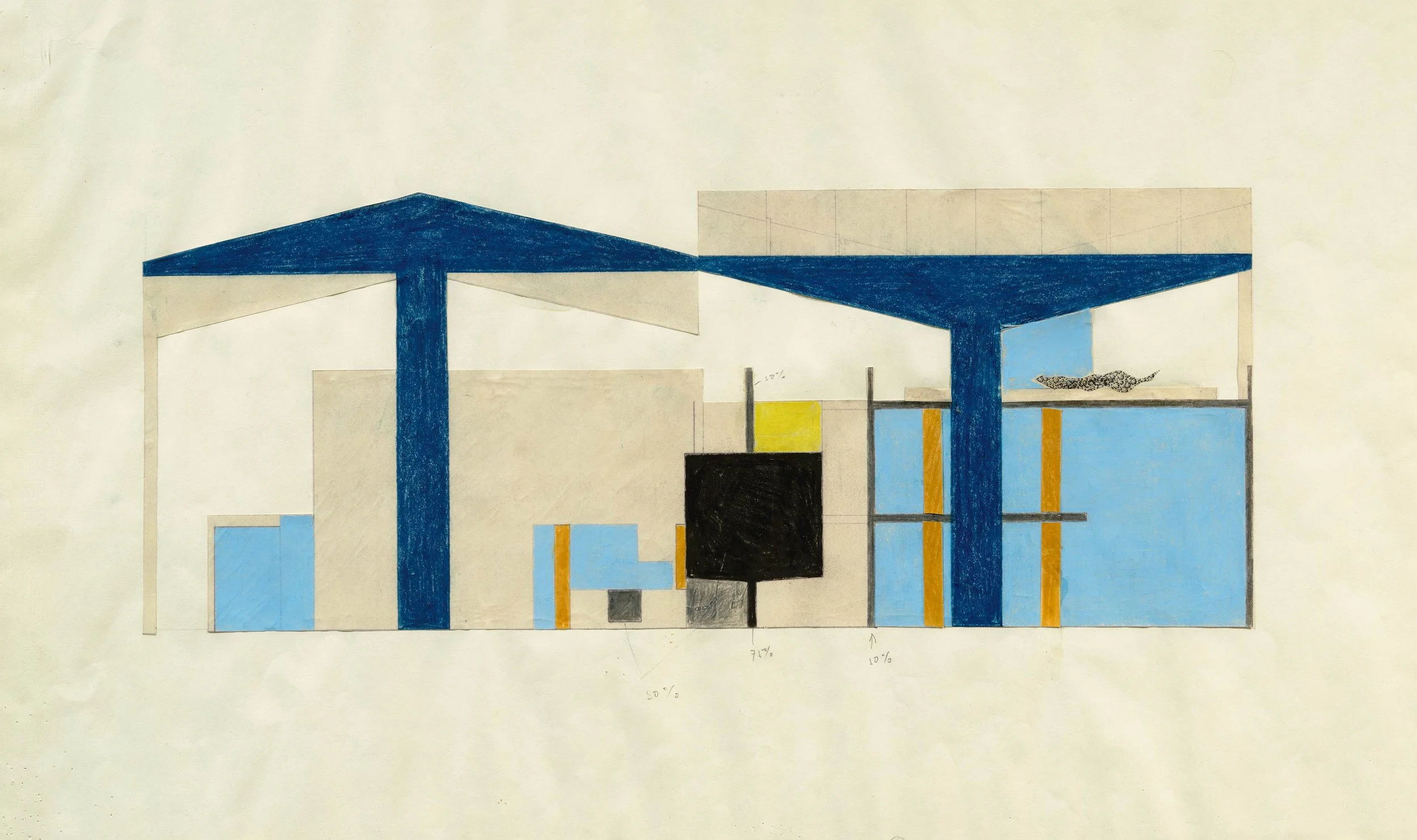
One of a set of 10 collages of the building plans for the Le Corbusier Pavilion in Zurich. Le Corbusier (Charles-Édouard Jeanneret-Gris). 1961. Colored pencil, pencil, ink and collage on paper. Image courtesy of Koller Auction, Geneva and Zurich. Kollerauction.com
That is where the relationship becomes especially important for designers. Art offers ways of thinking through symbolism, metaphor, abstraction, emotion, narrative, and meaning. Design gives ideas structure, purpose, function, material presence, and a place in lived experience. Bringing those ways of thinking into relationship can affect everything from the development of a concept to the choice of form, material, color, object, and detail.
This is not about adding a little art to design, or sacrificing function for poetry. Nor is it about making design look like art. It is about recognizing that the two can inform one another — and that their relationship can open possibilities that neither necessarily offers alone.
This was the argument behind Why Art & Design?, one of the earliest pieces written for RAD. Seen through the lens of the union of opposites, that founding idea becomes part of a much larger pattern. (For a deeper exploration of why bringing art and design back into relationship matters, see Why Art & Design?)
The goal is not to erase the distinction between art and design, or between the poetic and the practical. It is to understand what becomes possible when we allow them to work together.
And that is precisely where meaning can emerge.
For Further Reading:
Lomas, J. Derek, and Haian Xue. “Harmony in Design: A Synthesis of Literature from Classical Philosophy, the Sciences, Economics, and Design.” She Ji: The Journal of Design, Economics, and Innovation 8, no. 1 (2022): 5–64. https://doi.org/10.1016/j.sheji.2022.01.001
Murphy, Peter. “Design Research: Aesthetic Epistemology and Explanatory Knowledge.” She Ji: The Journal of Design, Economics, and Innovation 3, no. 2 (2017): 117–132. https://doi.org/10.1016/j.sheji.2017.09.002.
Connecting the Dots: Why design history matters to practice
Creativity in Design: From Inspiration to Intention
Creativity in Design: Before the Spark
Intro to Design Reform: What is Design Reform, and how did it start?

